The GDP of Good Design: Redesigning the Face of Regional Growth
Improve the user experience for site selectors, businesses, and those in charge of attracting them to Coastal Georgia.
OVERVIEW
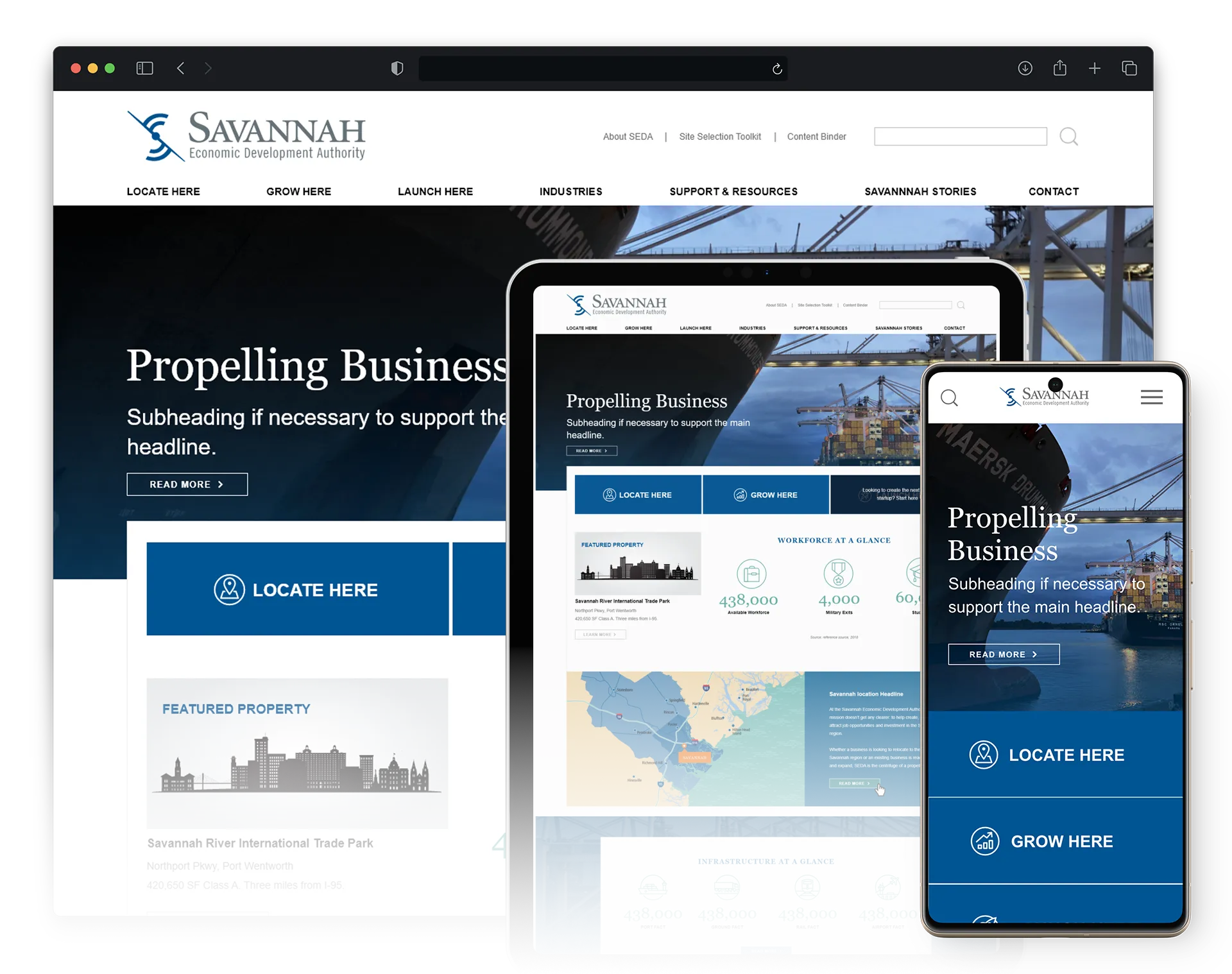
The Savannah Economic Development Authority (SEDA) has a 3-fold mandate: attract new businesses, help local businesses expand, and support new entrepreneurs. Their website plays a crucial role in this and can make a big impact on the region’s economic growth.
But SEDA’s website was outdated, difficult to navigate, and needed a back-end technology update. So they asked my team to upgrade the website’s UX/UI design and CMS. I was in charge of the UX/UI design portion of the project.
MY ROLE
Lead UX /UI Designer
PLATFORMS
- Desktop
- Mobile Web
DURATION
3 months
TOOLS
Adobe Photoshop
Adobe Illustrator
X-MInd
Adobe XD
SOLUTION
I was part of the team that conducted several client interviews, stakeholder surveys, and a UX audit of their current site.
Then after refining their information architecture, and navigating conflicting feedback, I delivered a responsive, WCAG-compliant UI design that has helped attract over $7B of regional investment to the region.
01. Strategy
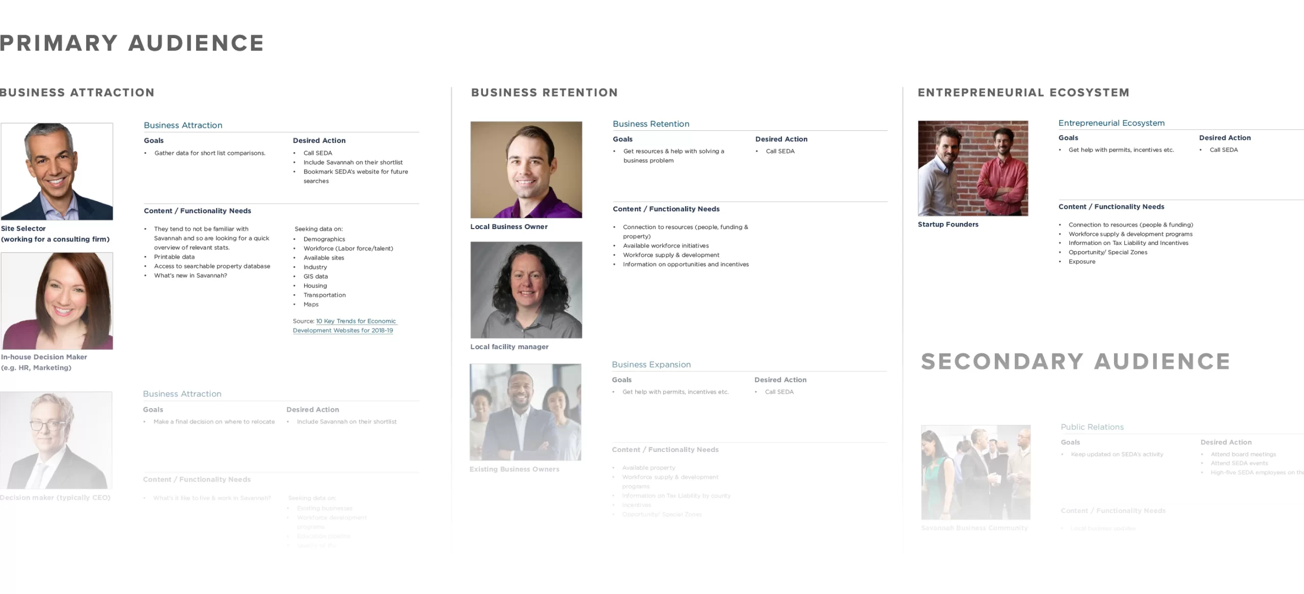
How do you serve not 3, but 4 target audiences?
Primary research
We scheduled a marathon interview session with several SEDA staff members to better understand their typical clients’ requests.
I learned that each target audience had unique content and functionality needs based on their economic activity. Factoring in the local business community with their need for transparency meant I had four sets of user needs to consider.
Secondary research
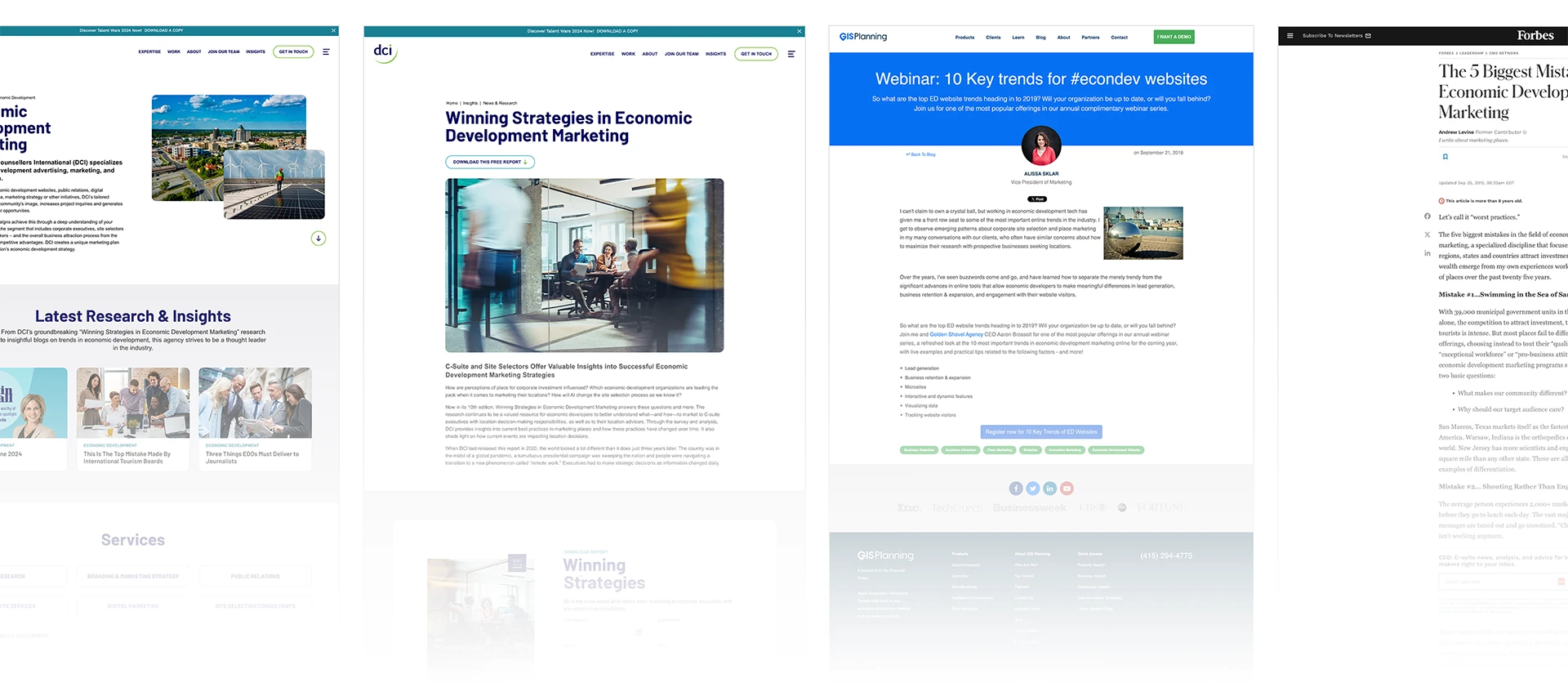
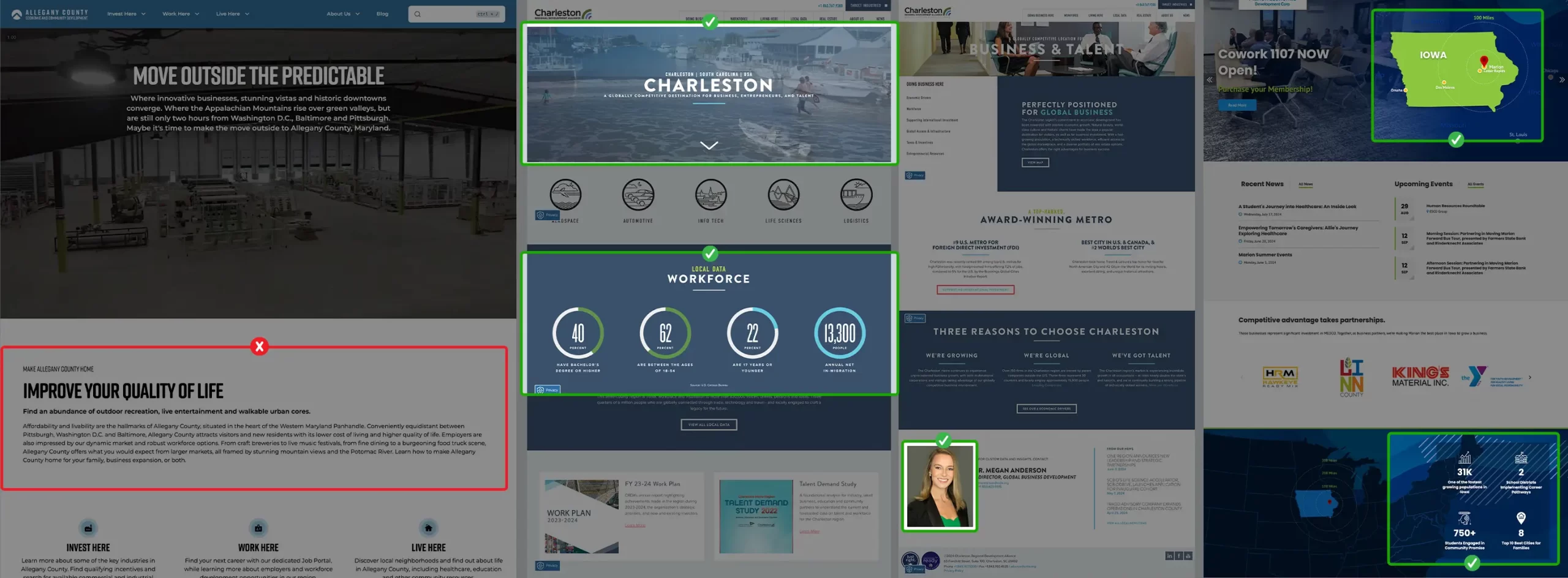
After identifying the primary and secondary audiences I scoured trade publications, blogs, webinars, and white papers for insights that would validate all I found out from the interviews.
02. SCOPE
UX Detective Work: Clues from Usability Errors and Competitors
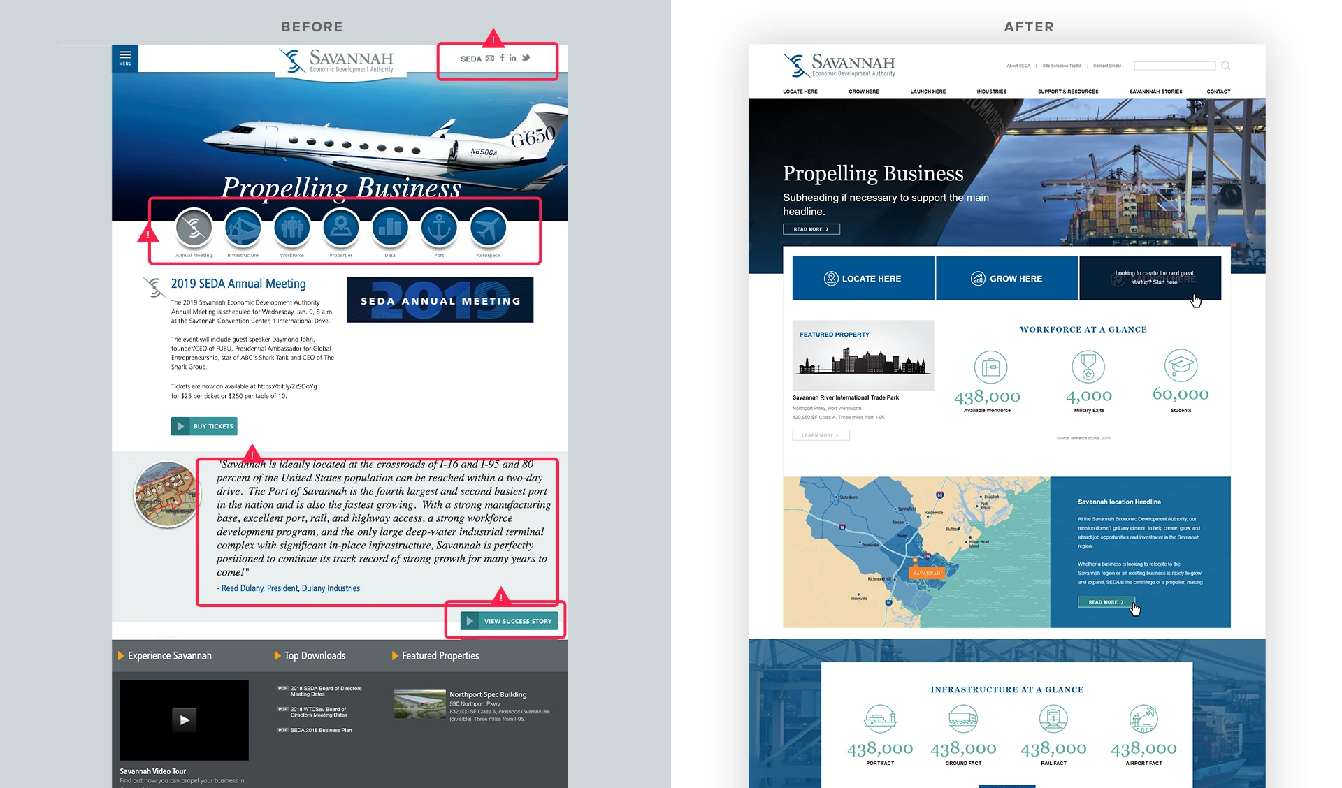
- The main navigation in the original site was hidden behind a hamburger menu even on desktop.
- The first nav item was About SEDA which is the least important information on the site.

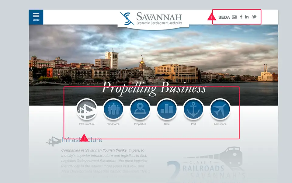
- The top right section of the website featured their contact links along with a link to their About page inexplicably labeled “SEDA.”
- The prominent features of the Homepage were only accessible via rollovers not tabs which made the information inaccessible to those who used keyboards.
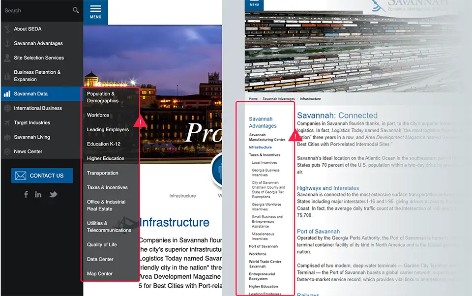
- Ignoring Hick’s Law, the main navigation and some sub-navigation lists were too long forcing users to waste time on wayfinding instead of getting the content they wanted.
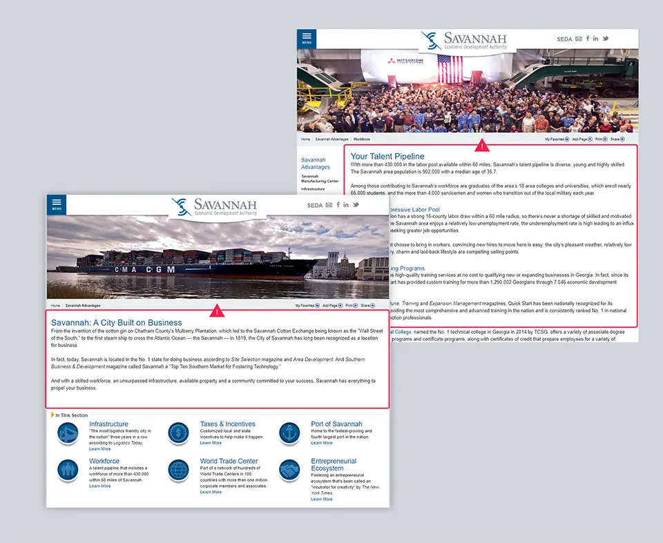
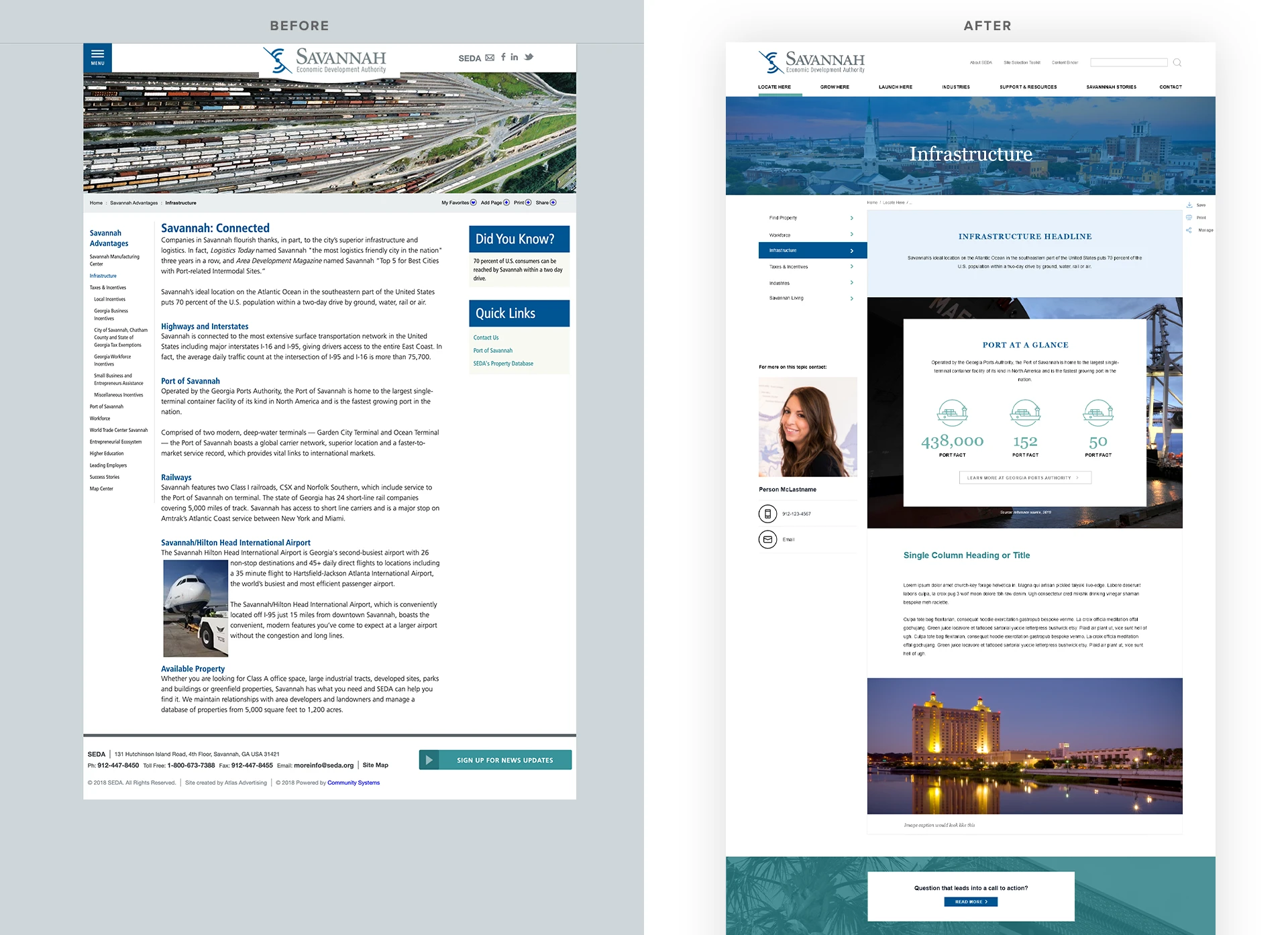
- Subpages were uninviting and not easily skimmable. Extra wide measures with poorly placed, dull photos.
02. Structure
Digital Feng Shui: Harmonizing the Site’s Content Layout
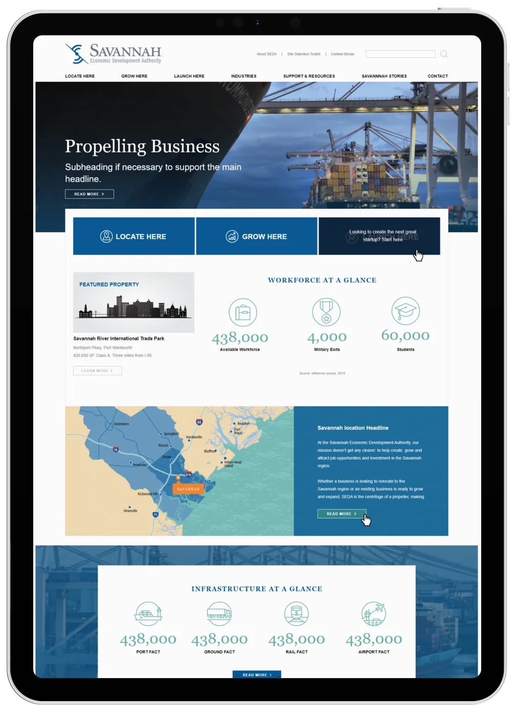
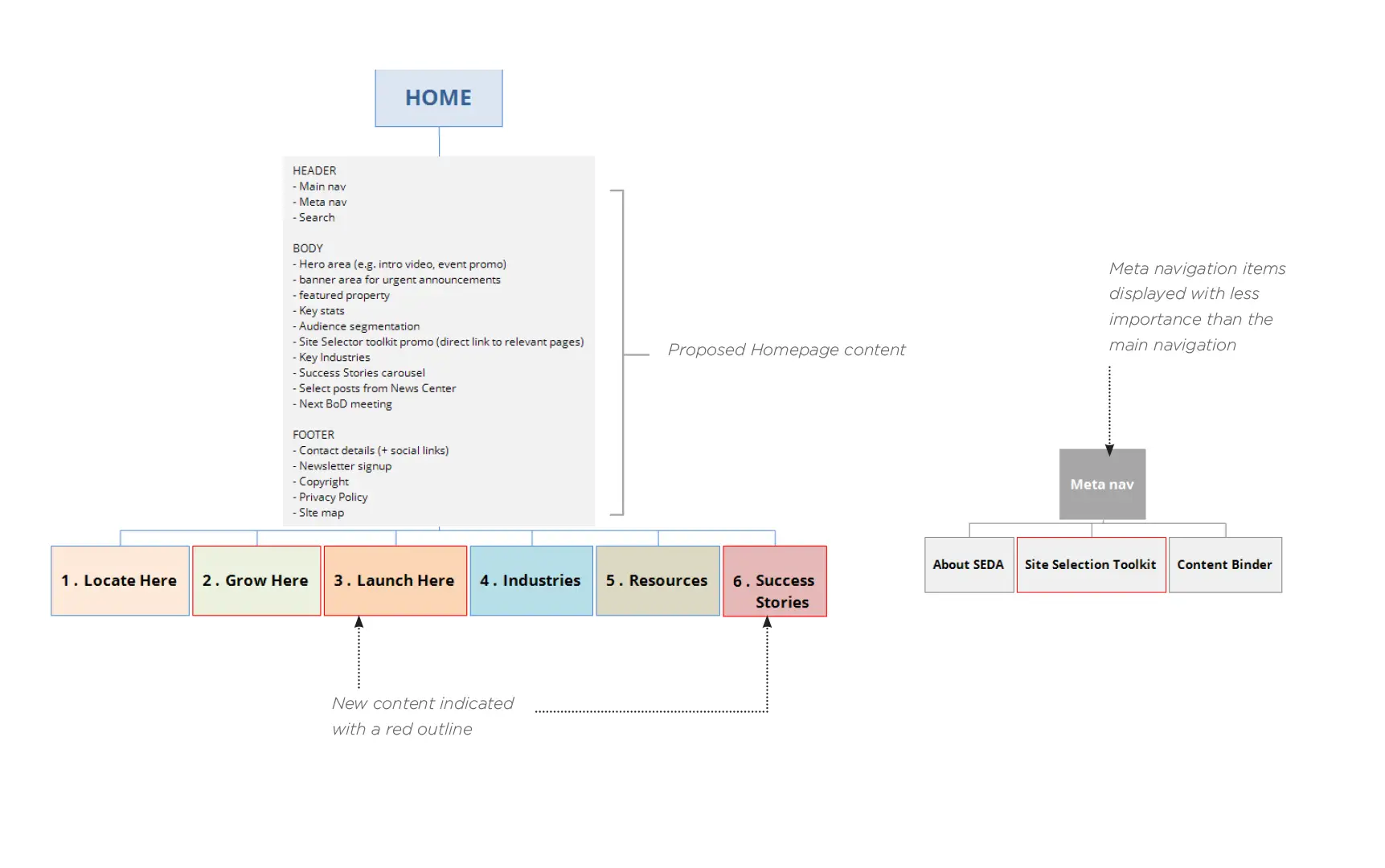
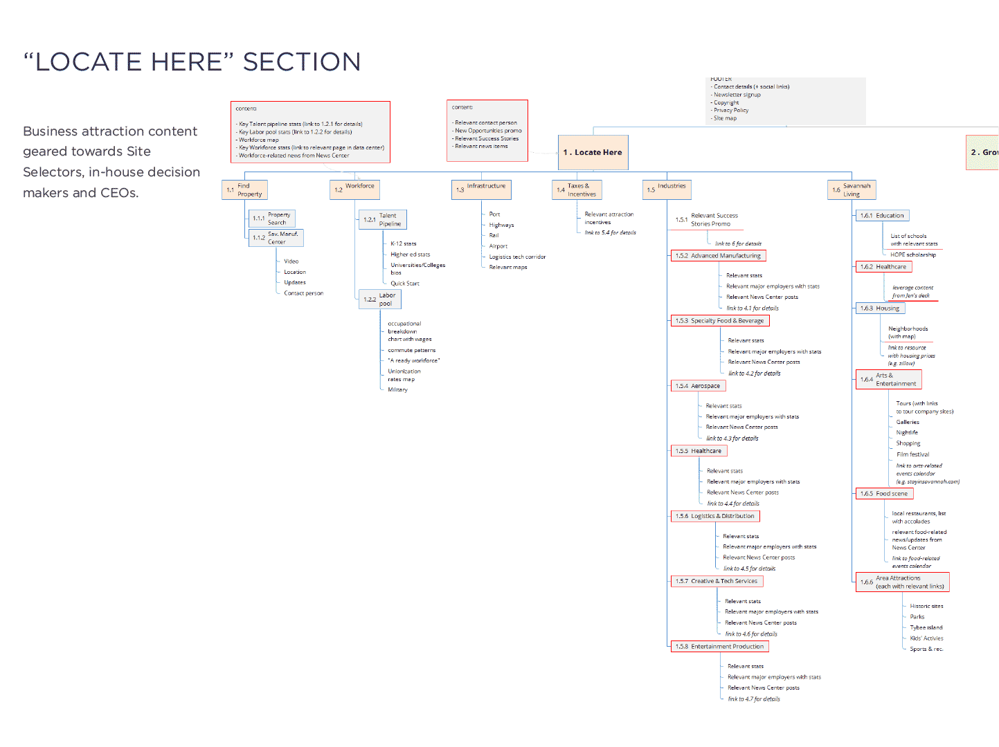
My information architecture centered around consolidating the unique content that each target audience needs under three topic clusters “Locate Here”, “Grow Here”, and “Launch Here.” Then the resources they all need would be housed under their respective categories; “Industries”, “Resources”, and “Success Stories.”
03. Skeleton
Screen Real Estate: Picking Prime Locations for the Right Content
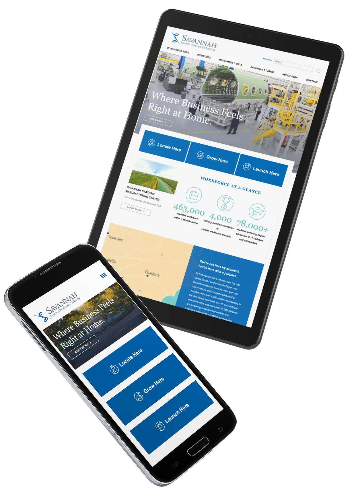
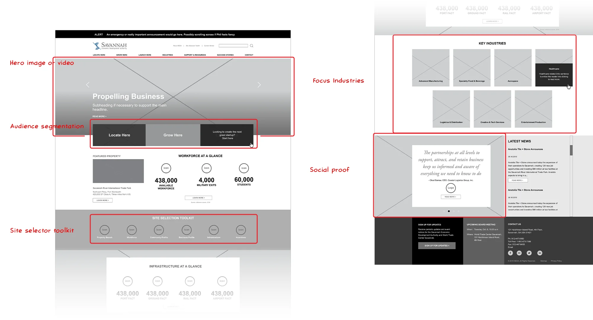
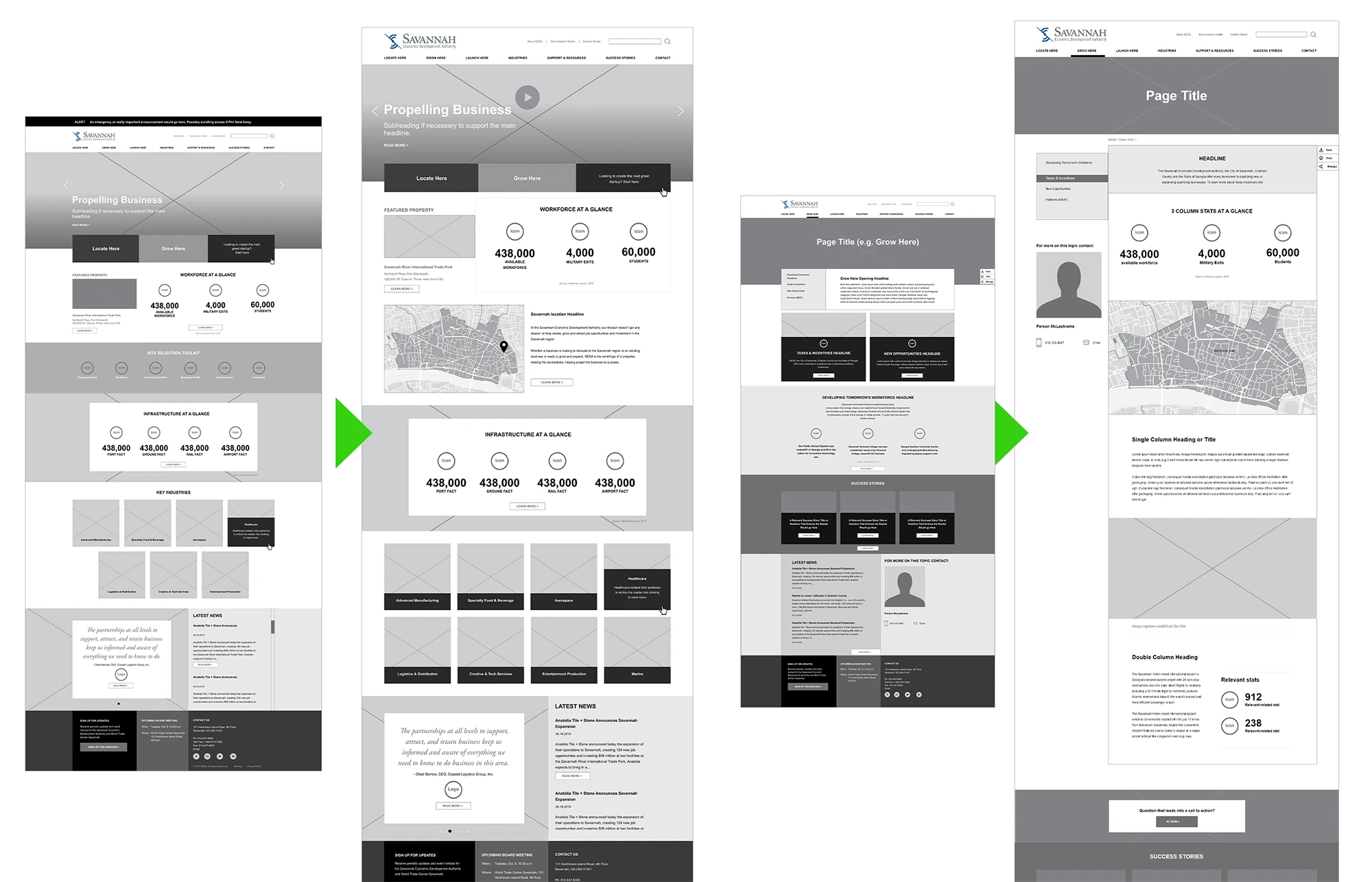
The main goal of the new website is to quickly direct site selectors, startups, and business owners to the content they need. So, I placed large buttons in the hero section for each of the three main target audiences, providing them immediate access to relevant content.
The rest of the content was prioritized based on what made the most compelling case for investing in the region.
There were also plans to prepare a section of the site for tools unique to site selectors, but that plan soon got scrapped in what I call “The Great Reshuffling.”
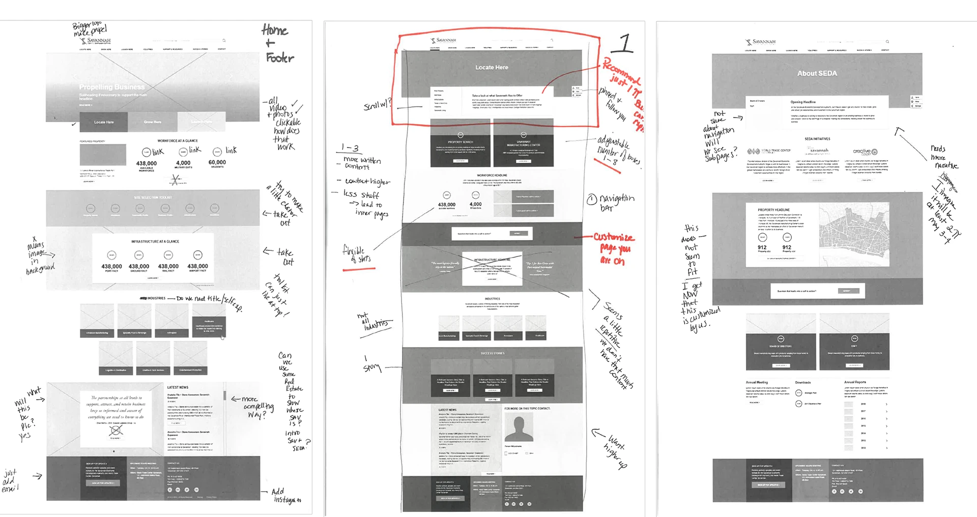
After a few rounds of revisions, I removed the major audience categories from the main navigation, choosing instead to reshuffle that content into new categories. But I was able to keep the segmentation buttons on the Homepage.
Honestly, the suggestions from the client ended up improving the layout tremendously, especially on the subpages, where I fixed a major issue with how the sub-navigation would work.
05. Surface
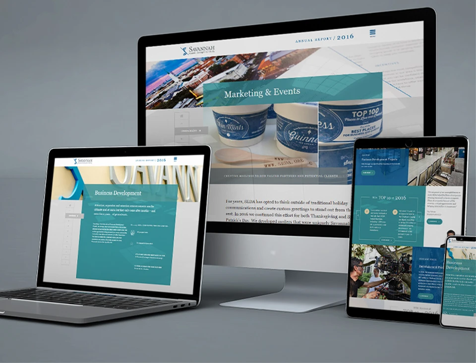
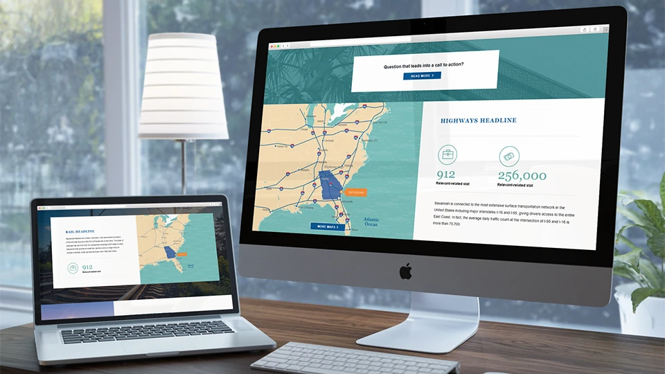
Digital Facelift: Unveiling SEDA’s New Look

What did I learn?
Manage Board feedback
Board members have different viewpoints. I could justify my design choices based on our team interviews and best practices, but without understanding the users, I couldn’t fully defend my decisions from the perspective of their target audience.
Show them I heard them
I need to show the client (especially when there are multiple opinions) how I’ve used their feedback. It’s important to explain which ideas will be included and why. This helps them see how their input matters and avoids confusion about what’s most important.
Document decisions
I’ve learned to document every design decision throughout the process, including why I made it and how I used feedback. This helps keep everyone on the same page and prevents us from going back and forth on the same things.
