Design, Wireframes, Action! Upgrading the Film Savannah Website
Make finding locations easier for scouts, getting project approval easier for filmmakers, and life easier for the folks who bring Hollywood to Savannah.
Turning Away Talent: The Website’s Negative Impact
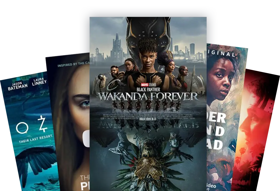
Quick! Think of a movie shot in the last 5 years. Now a TV show? Chances are, most of it was shot in one of the many locations available around Savannah, Georgia. But the one thing preventing the next Oscar or Emmy winner from filming in Coastal Georgia was its Film Commission’s website.
PLATFORMS
- Desktop
- Mobile Web
MY ROLE
- Conduct client and stakeholder interviews
- Create personas
- Conduct competitor review
- Reorganize information architecture
- Produce wireframes
- Create clickable, responsive prototypes
- Create a scalable design system
- Collaborate with developers to ensure WCAG compliance
DURATION
3 months
The Website That Lost the Plot: Usability Problems
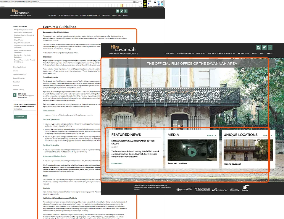
The previous website was outdated front and back, hindering Savannah’s ability to attract film projects, which negatively impacted the local film industry and its growing workforce.
Designing a Digital Reboot
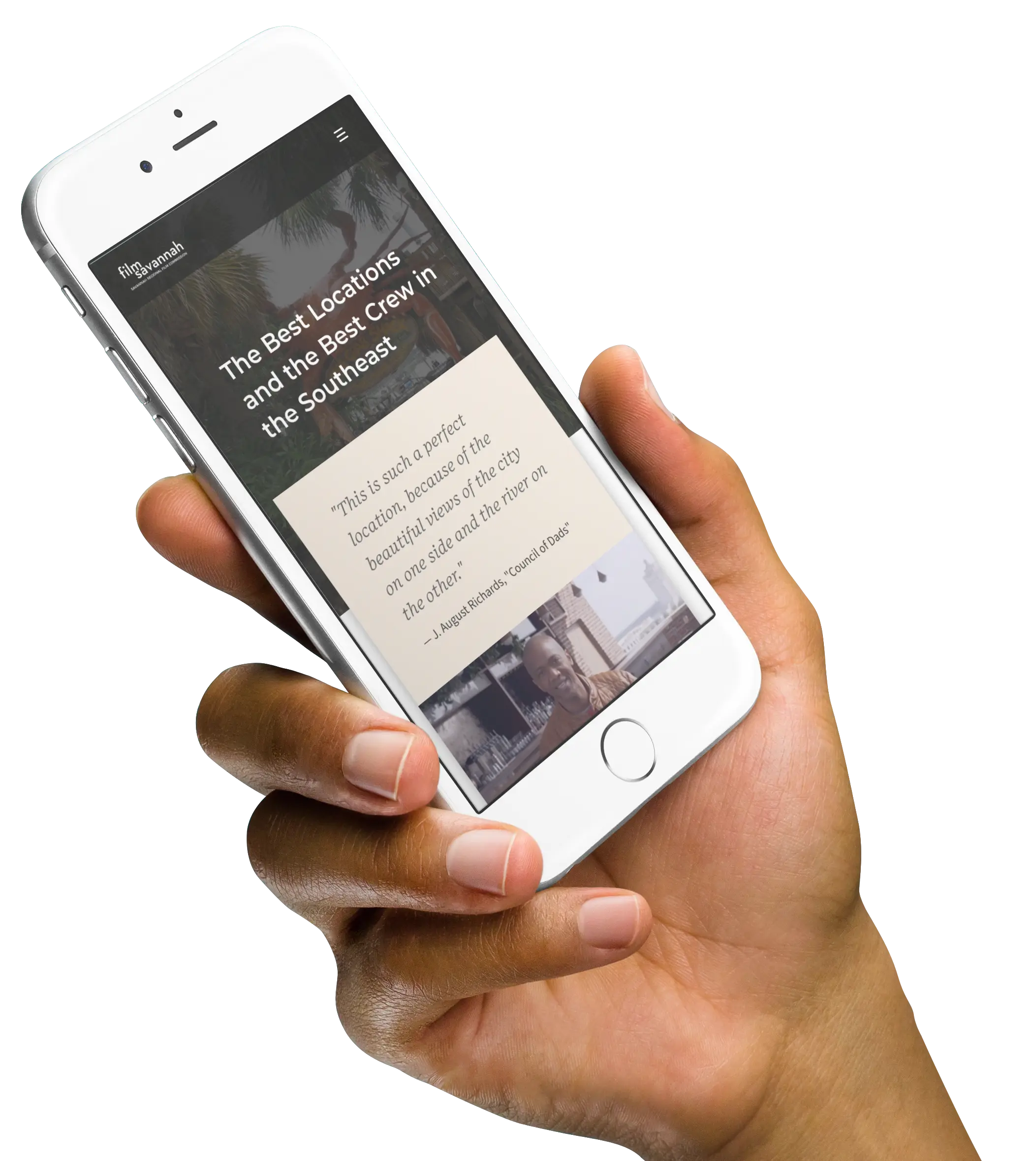
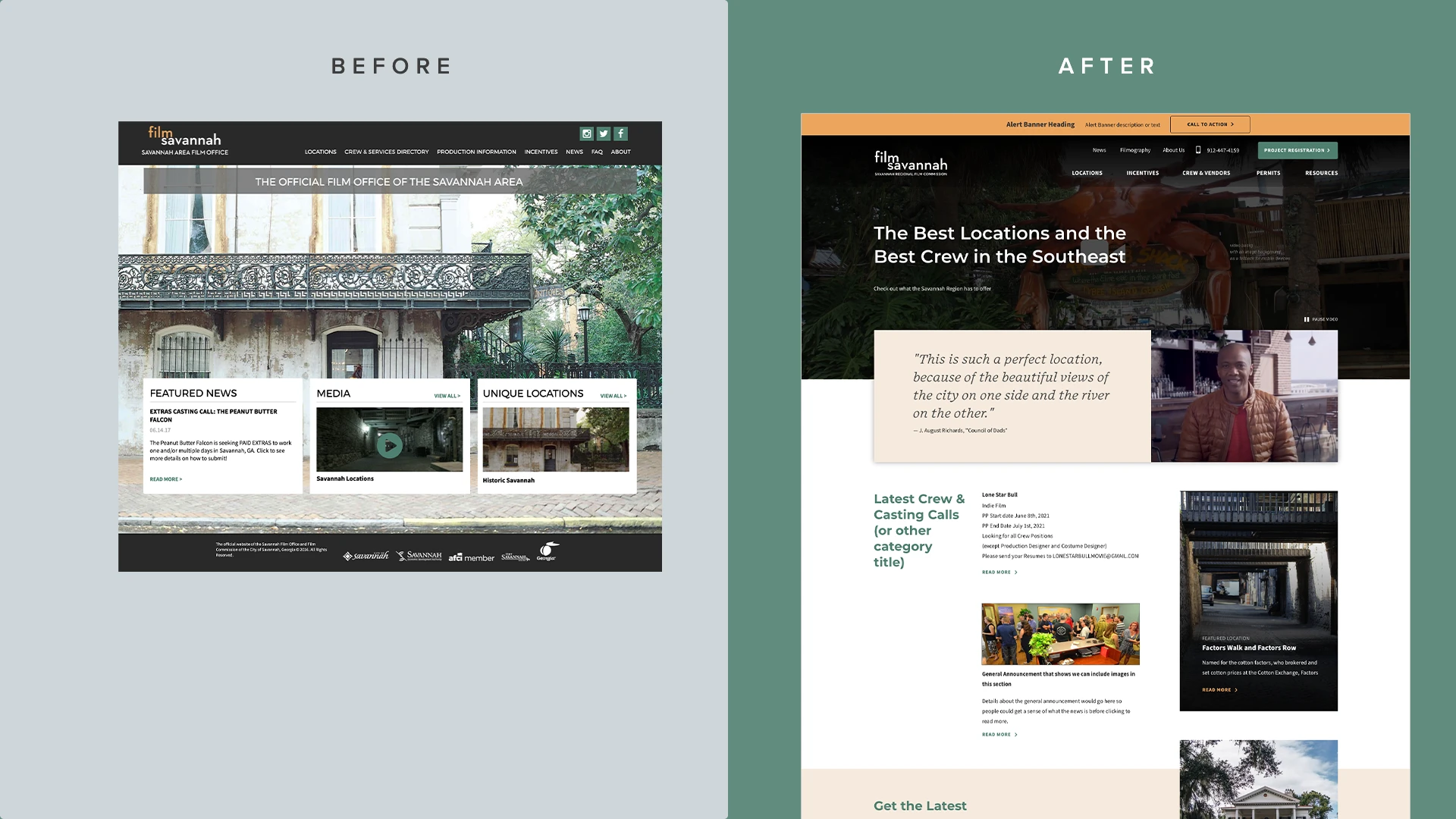
I conducted client interviews and a competitor survey, created site maps, wireframes, and prototypes, and handed off a complete UI kit to the development team. This resulted in a fully functional, responsive website on WordPress, improving access to location information and crew calls while making site maintenance easier for FilmSavannah staff.
Results
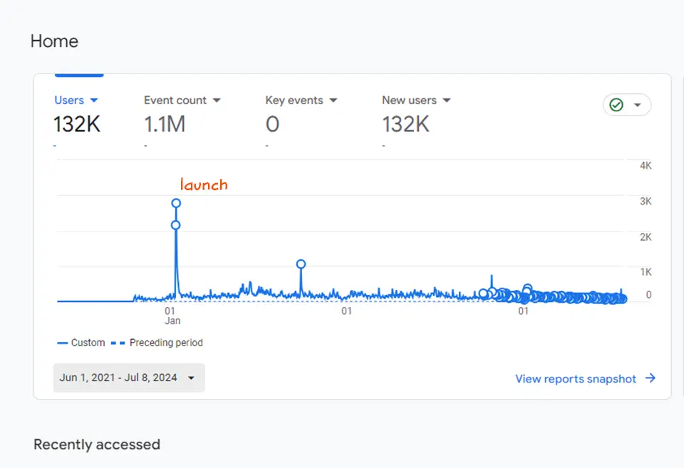
The team at filmsavannah are over the moon with how easy it is to keep our content fresh. The launch was a huge hit, with traffic skyrocketing a whopping 1,000% initially. Things have calmed down a bit since then, but we’re still seeing a solid average of 200 daily users.
The Process

01. Research
Setting the Stage with Audits and Interviews
I conducted client interviews and a site audit to understand their goals, current pain points, content & functionality needs.
Pain points:
Hard to Maintain
It’s hard for their staff to update information. This was critical since they regularly update casting/crew calls and the growing film talent pool in Savannah relies on this being up-to-date. They even resorted to creating separate landing pages to house more relevant content instead of trying to work with the CMS to add it to the site.
Hard to Navigate
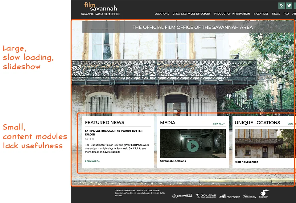
It’s difficult for their audience to find information. Particularly their phone number, the project registration form, and newsletter sign-up form.
Mobile Unfriendly
The Homepage features a large slideshow in the background slowing down the load time.
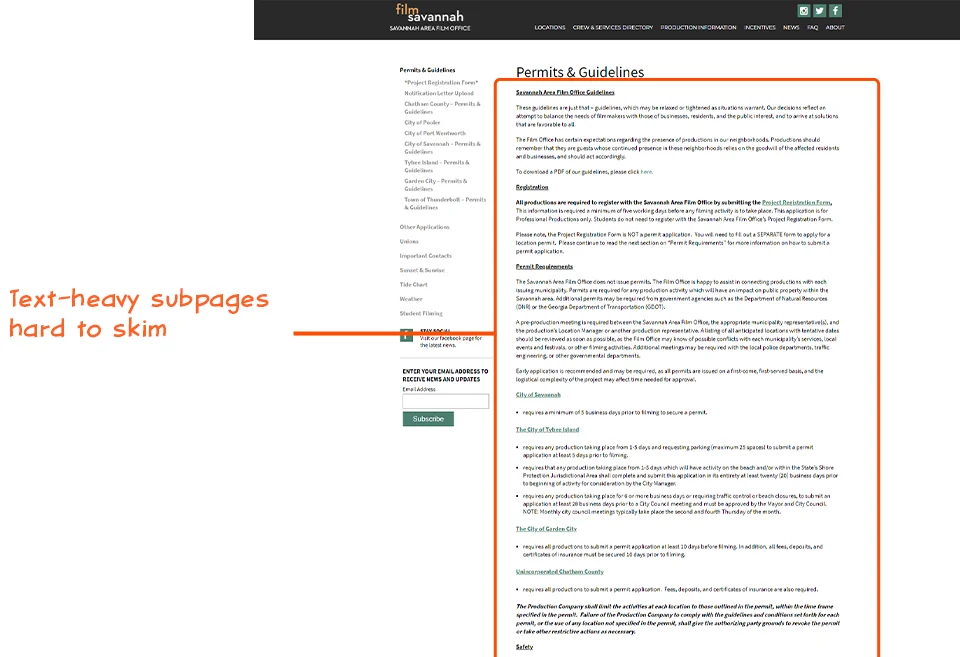
Lots of text-heavy subpages make them hard to skim.
02. Insight
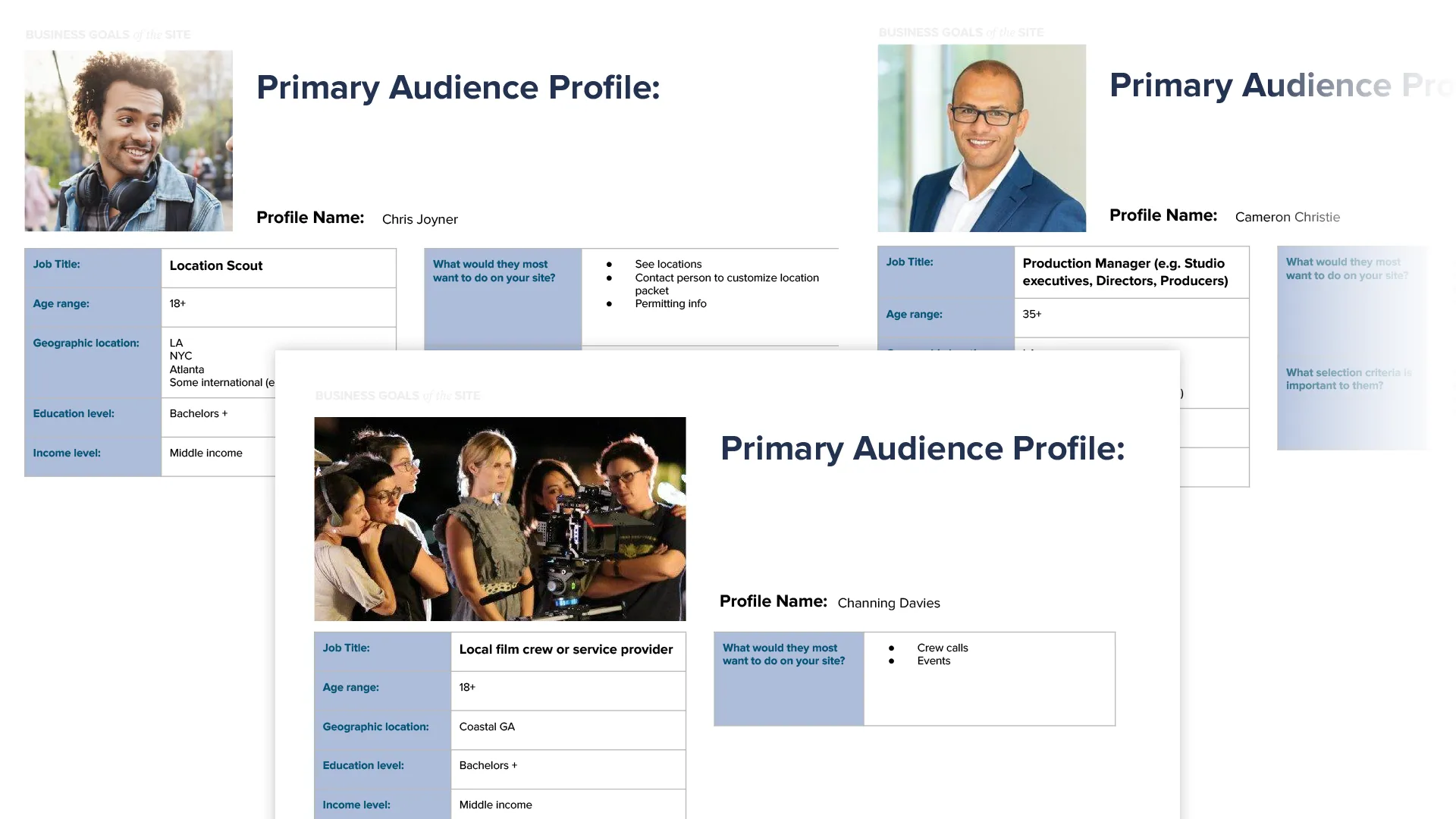
Casting call for personas
After in-depth interviews with the client, local filmmakers, and crew we settled on our four primary and secondary personas (Location scouts, Production Managers, Local talent & crew, Local filmmakers, and the FilmSavannah staff).
Learning from competitors’ hits and flops
I also looked at some of FilmSavannah’s competitors to see what we could steal, learn about how they structured their content and styled their sites. These were the three that stood out:
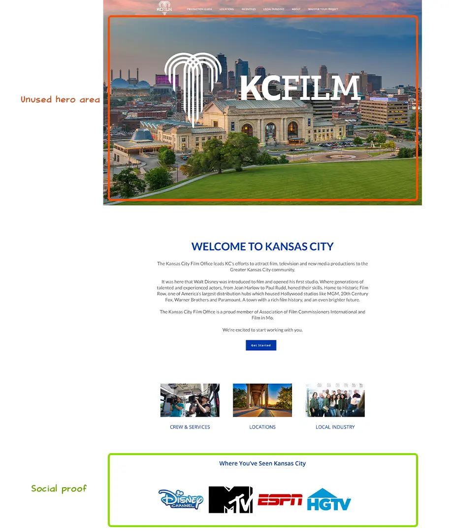
Kansas City Film Office
- Large hero slideshow takes too long to load
- Opening paragraph isn’t useful to the target audience so ends up wasting valuable screen real estate
- Simple, mobile-friendly design (+)
- Social proof by showcasing logos of past productions (+)
- Prominent newsletter sign up (+)
- Prominent register button (+)
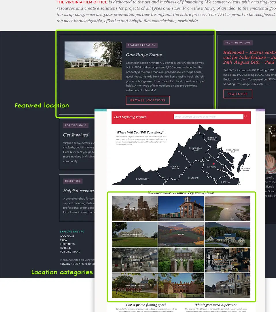
Virginia Film Office
- Hero area showcasing the diversity of locations (+)
- Featured location promo along with casting call promo (+)
- Location categories (+)
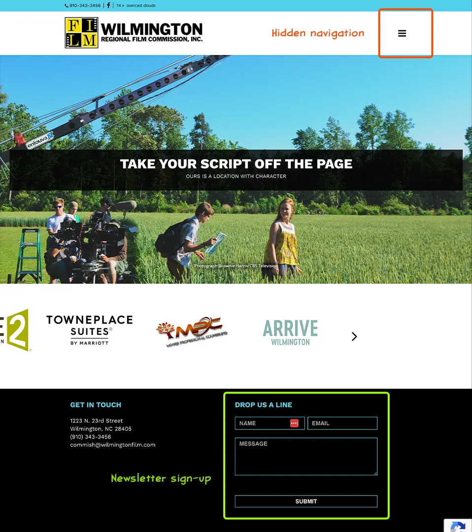
Wilmington Film Office
- Hero area showcasing locations (+)
- Easy to find topic areas for location scouts (+)
- Hiding navigation behind a hamburger menu (-)
Initial Insights
Location scouts, their most important target audience, are typically accessing the site on their phones while distractedly driving from location to location.
Users are most likely in a “hunting” frame of mind, so they’re not trying to browse around aimlessly, but are searching to find a particular location type.
Users tend to prefer calling someone with questions than fill out a contact form or email.
03. Ideation
A new script: rewriting the website’s structure
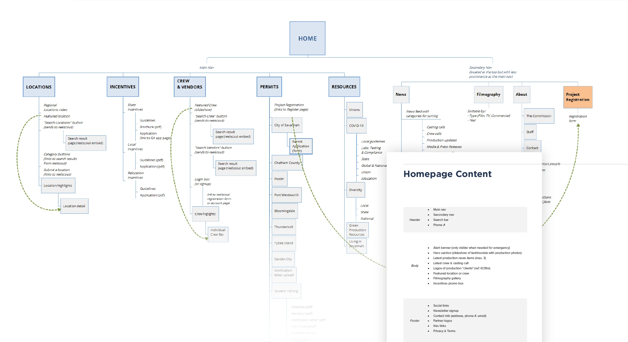
Updated Information Architecture
I structured the content into two main sections: core needs (Locations, Incentives, and Crew for scouts; Permits and Resources for filmmakers) and secondary content (News and About). I also included essential calls to action in the top right corner: a phone number for scouts and a project registration link for filmmakers.
Finding the right aesethetic
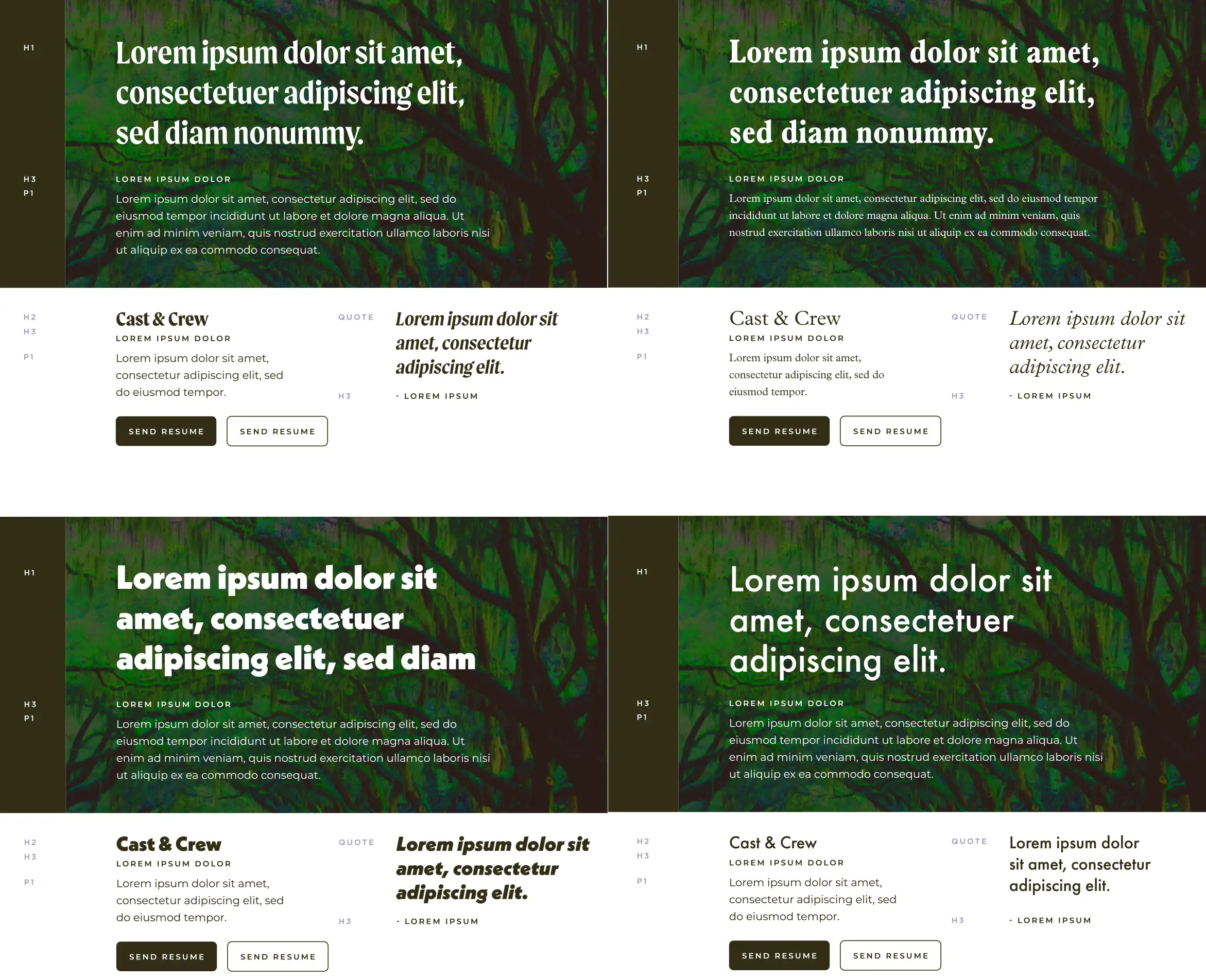
During the research phase, the FilmSavannah team gave us a list of attributes they wanted the new website to portray:
Professional. Clean, Searchable, Not cluttered
So I presented a range of font combinations for the website that I felt embodied these attributes. They ultimately leaned towards the sans-serif options as they felt it offered a clean, straightforward look while still being approachable. To add a touch of character, we incorporated an italicized slab serif for quotes and testimonials.
The Rough cut of the UI starts with a close-up on value
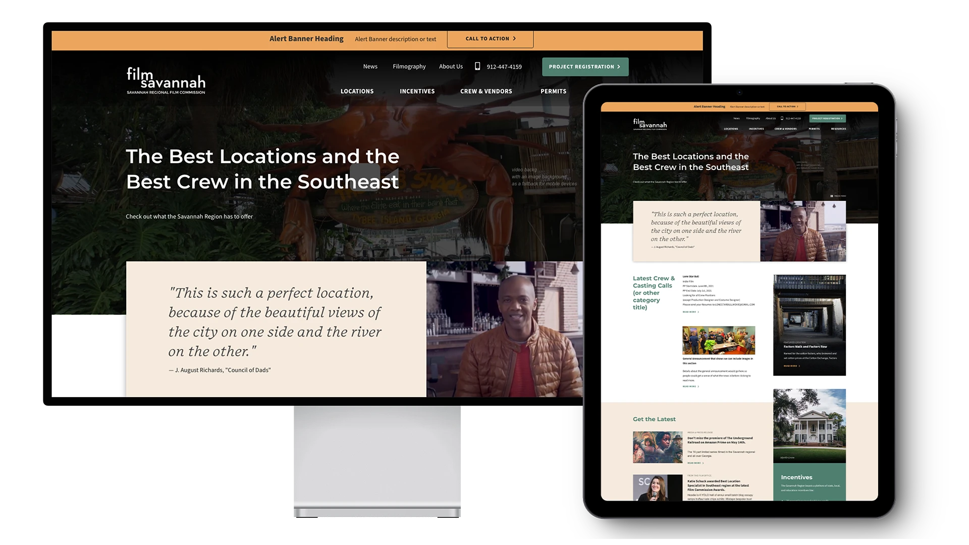
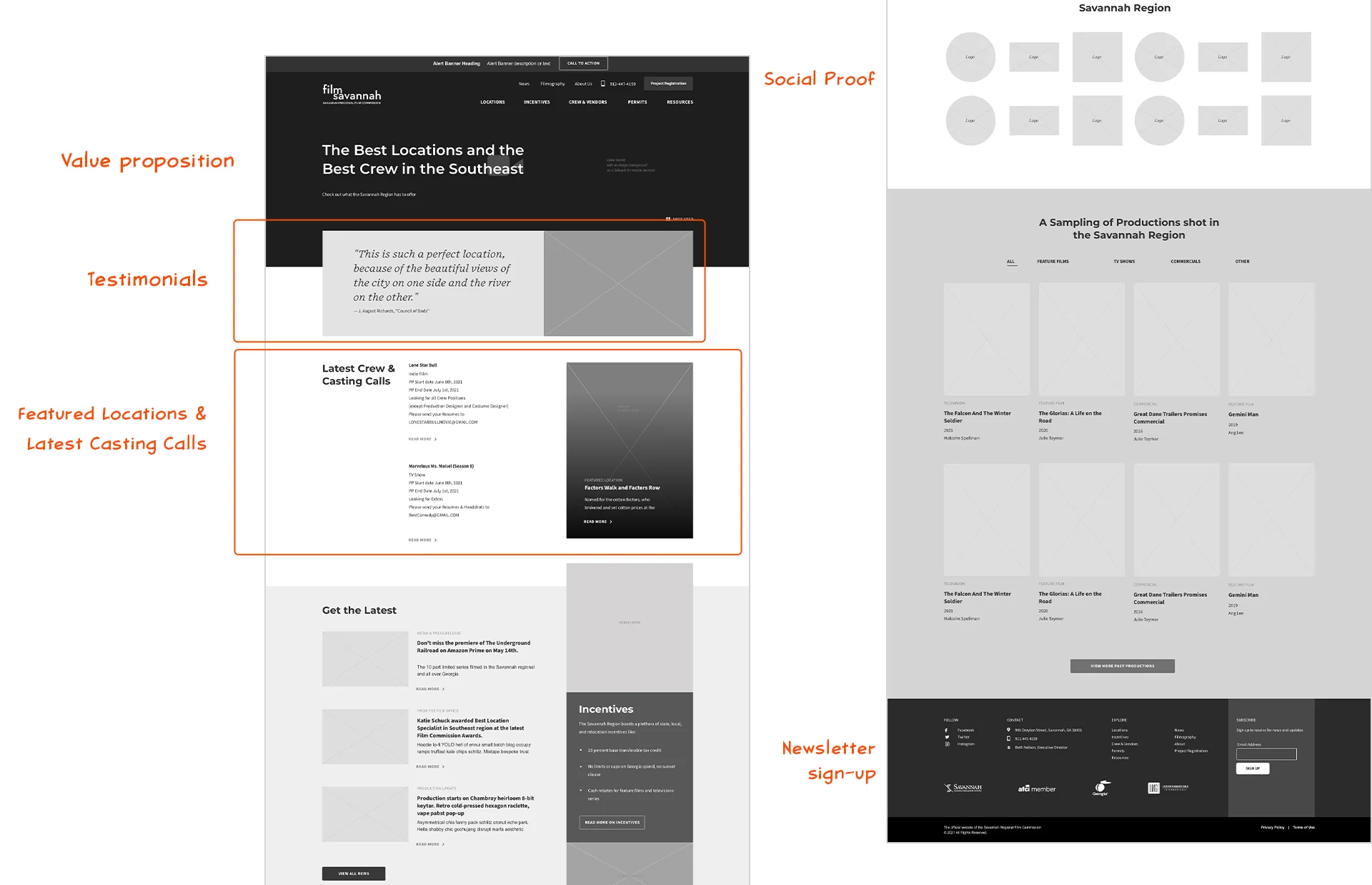
While the client was chewing on the visual style options I took my first stab at reorganizing the Homepage. I chose a demo reel, testimonial, and a featured location/crew area as top priorities.
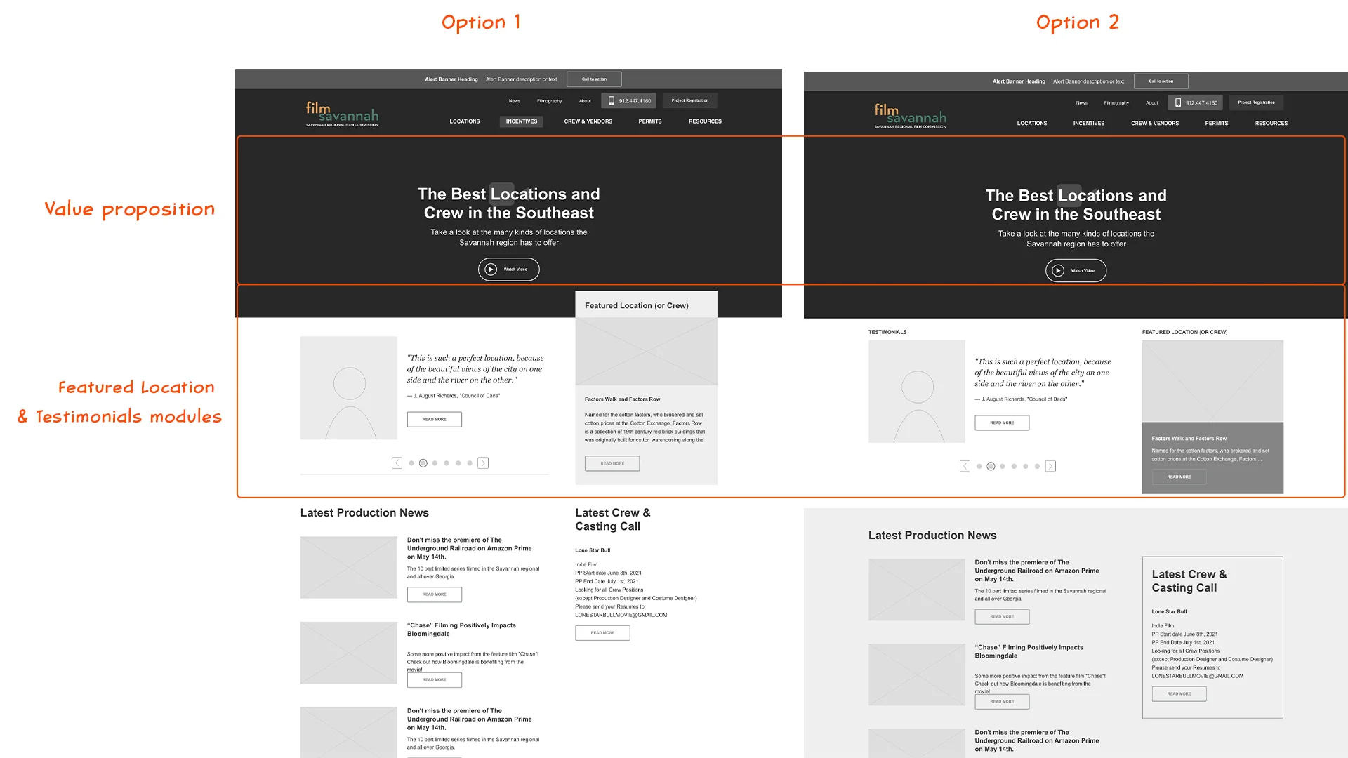
The client felt this pushed the casting and crew calls section too far down on the page, so in the next set of wireframes I played with including the testimonial as the main heading text.
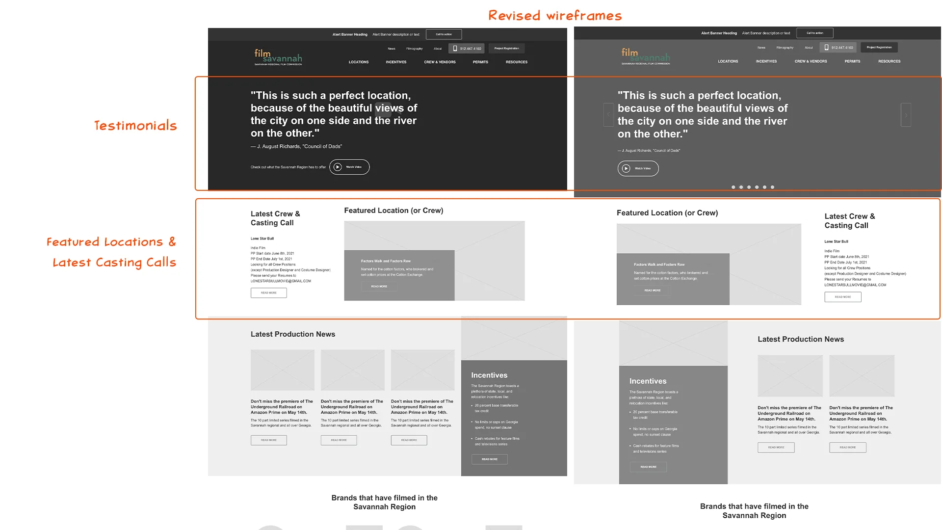
Removing the concise value proposition from the top of the page created an unexpected challenge. Testers felt a moment of confusion before understanding which site they were on.
So I brought back the short value proposition statement, removed the play button for the demo reel, and added a prominent overlapping area for the testimonial. This increased the impact of the testimonial and the upfront social proof seemed to resonate with viewers.
Key Takeaways
Prioritize Clear Value Proposition
The importance of a strong, immediately visible value proposition cannot be overstated. It anchors the user’s understanding of the site.
Balance Visual Impact with Information Hierarchy
While a strong visual element like a testimonial can be effective, it’s crucial to maintain a clear information hierarchy. Overly dominant elements can disrupt user flow.
Social Proof Matters
The positive response to the testimonial highlights the power of social proof in building trust and credibility.
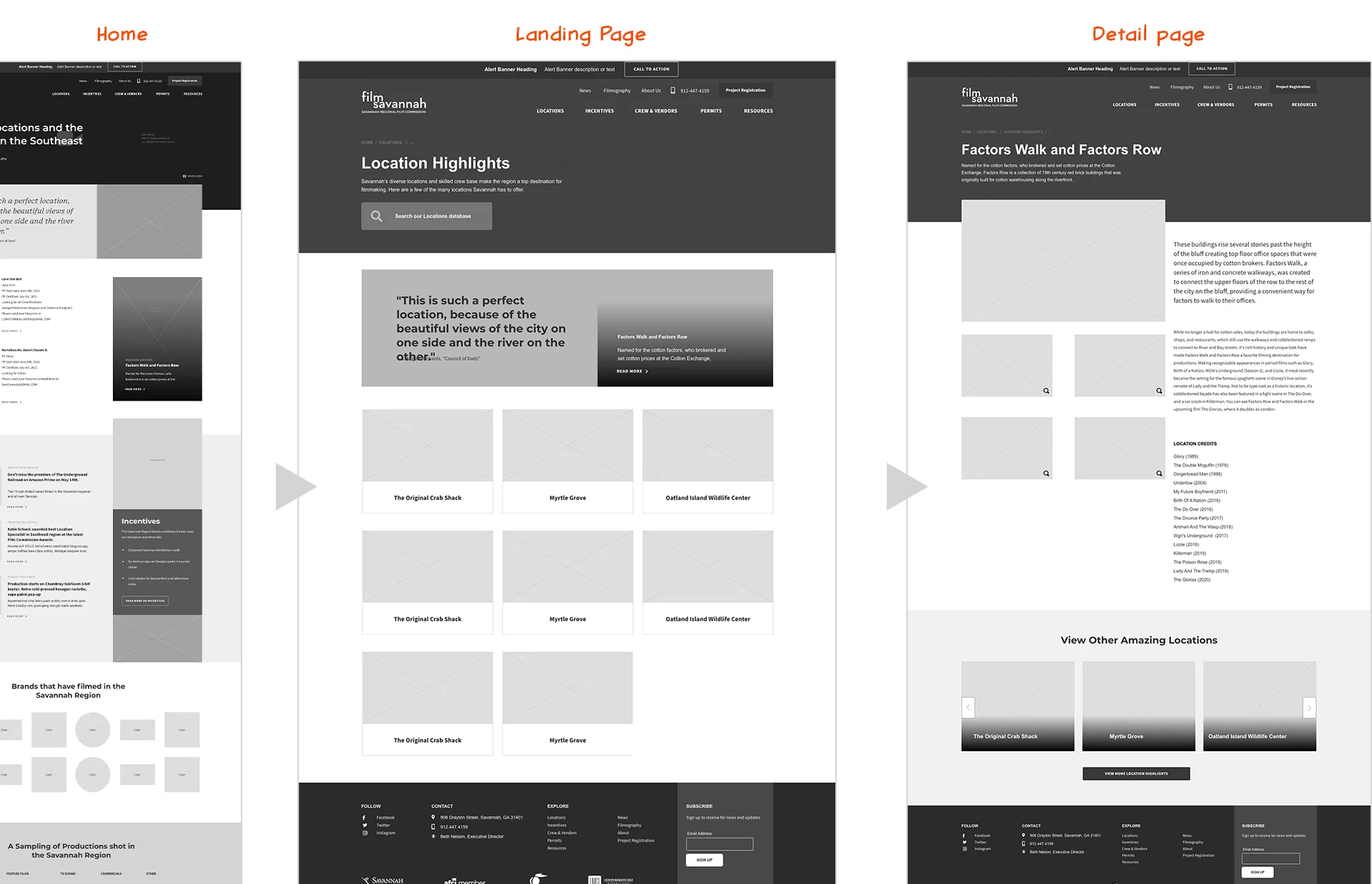
This experience with the Homepage helped me quickly wireframe the key subpages. I made sure the pages like the Locations and Crew landing pages kept the visual hierarchy of the Homepage as well as including all the content the FilmSavannah team wanted.
04. prototypes
Realizing the Director’s vision by integrating style and structure
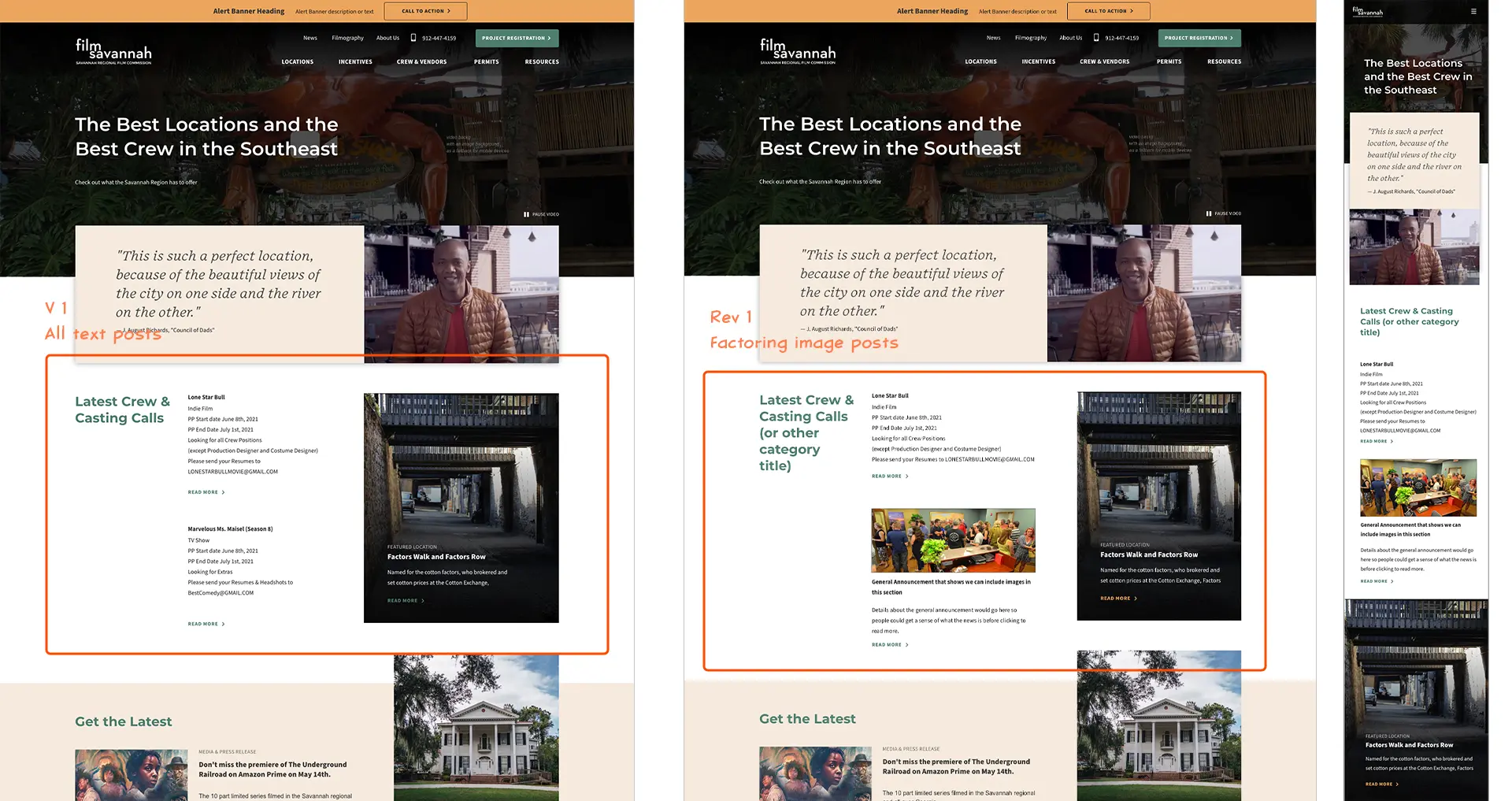
Splitting up the form and content aspects of the design this way meant that once we got to this stage there were very few edits needed. The only thing I missed was showing what the Latest casting/crew calls would look like if there was an image attached to one of the posts.
What did I Learn?
Plan for Edge cases
This project was one of the smoothest client experiences I’ve ever had working on a website. But, once we handed over the keys to the CMS, the client produced some unexpected results as the design responded to situations I hadn’t planned for.
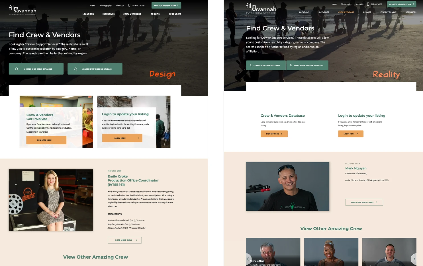
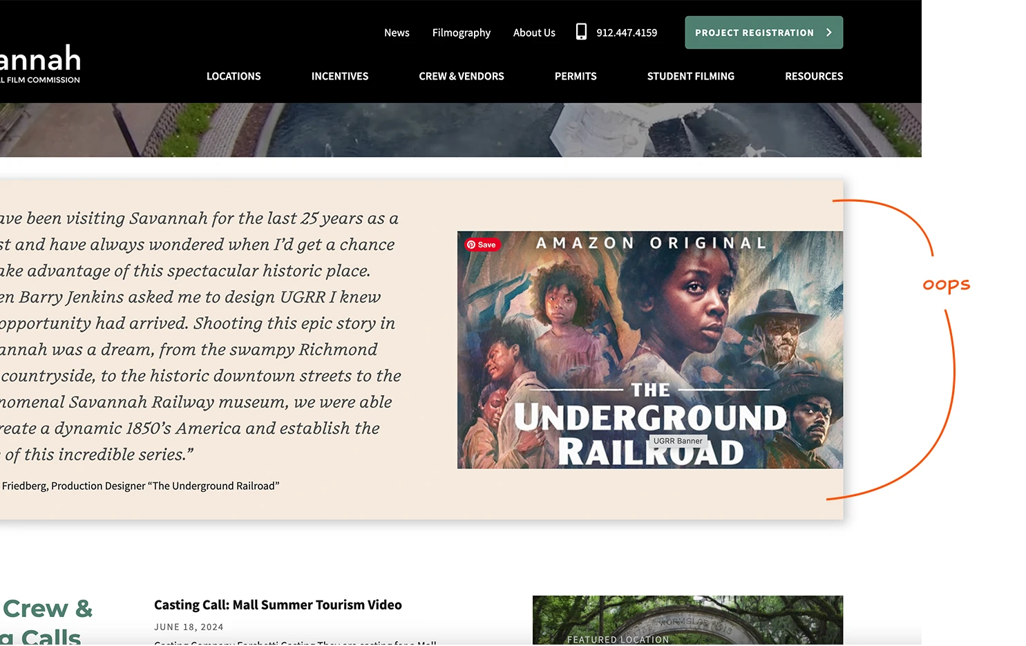
For example, I should have specified a character limit for the Homepage testimonial section to prevent it from getting too tall. Plus, I should have specified how the image in that section should fit to fill the height so we wouldn’t get these odd spaces above and below the image.
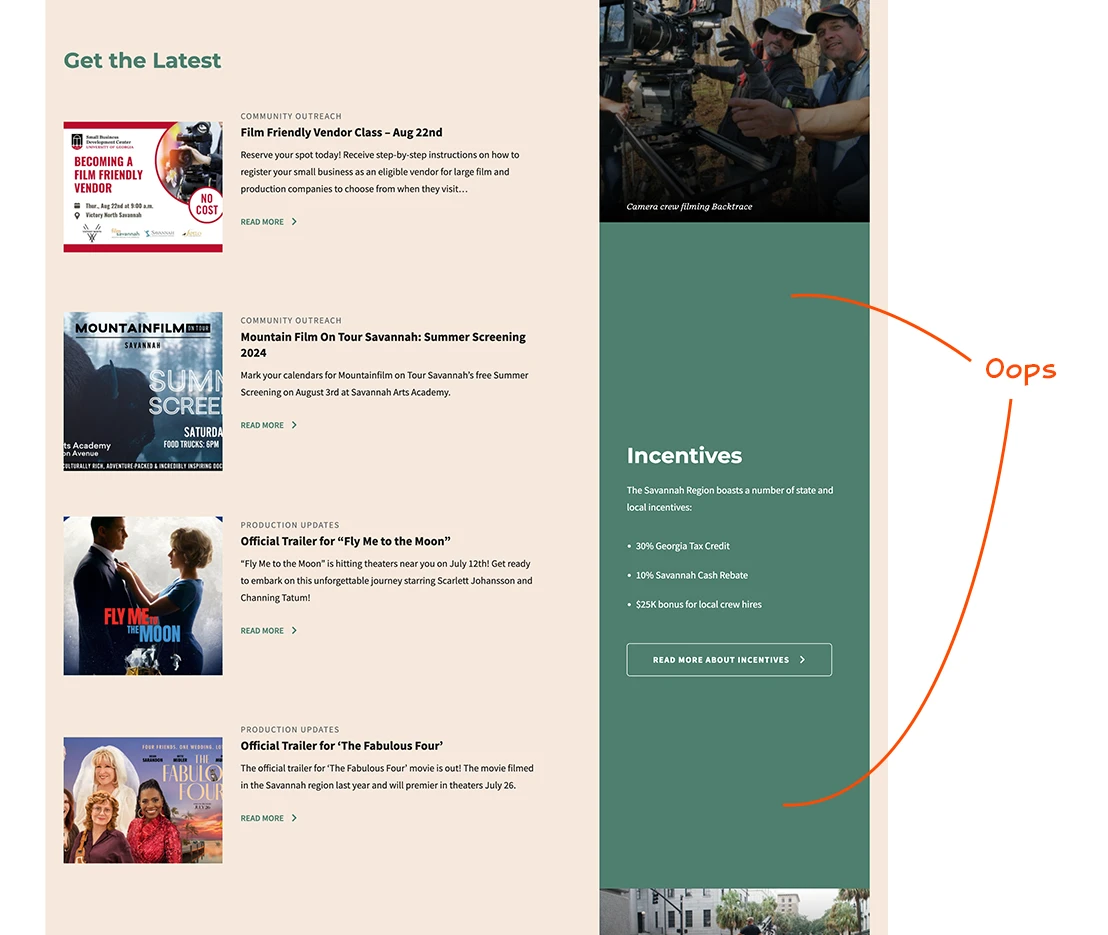
Likewise, I should have had a plan for what happens to the Incentives section if ever the Latest News section is longer than I had planned.
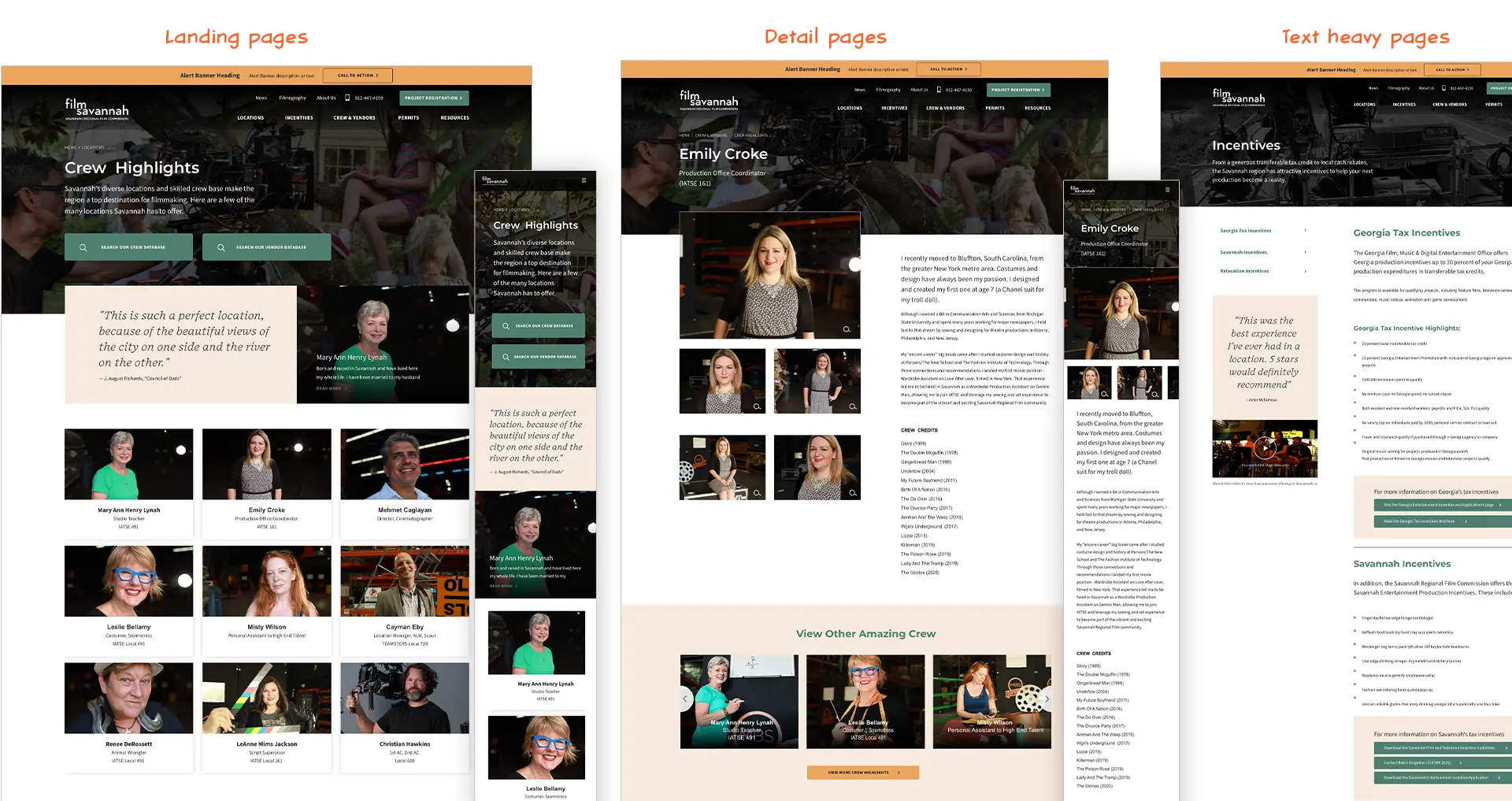
Similarly, I should have a plan for what happens when a section doesn’t have an image associated with it like these promo boxes on the Crew & Vendors landing page.
