The Health History Whisperer: Designing the Carefile App
Ease the mental load of parents with an app to keep track of their K-12 kids’ medical records
Medical Records: A Parental Headache
Parents have a hard time keeping track of their kids’ medical records. Especially considering the frequency with which these records get updated after every doctor visit, physical, or immunization. Not to mention requirements from childcare facilities and schools that these records be submitted for every child.

MY ROLE
- Conduct user interviews
- Create personas
- Conduct usability tests
- Produce wireframes
- Create clickable prototypes
- Create design system
PLATFORMS
- Mobile App
DURATION
2 weeks
The Goal:
Help parents organize their children’s doctor’s appointments and medical records, which will help them not worry about missing an appointment or losing a vital document ever again.

1. Understanding the User
- User research
- Personas
- Problem statements
- User journey maps
- Unique value proposition
- Storyboards
- User flow
Understanding the Struggle to Keep Kid’s Medical Records Organized
In addition to my experience unsuccessfully keeping my children’s medical records in order, using an ad-hoc system of offline and online folders, I also interviewed other parents of school-age kids for insights into their struggles keeping these documents organized.
Pain point I
It’s hard for parents to keep their child’s medical records organized so they can access the right one when needed.
Pain point 2
It’s hard to keep track of doctor’s appointments and the paperwork that ensues.
Problem statement 1:
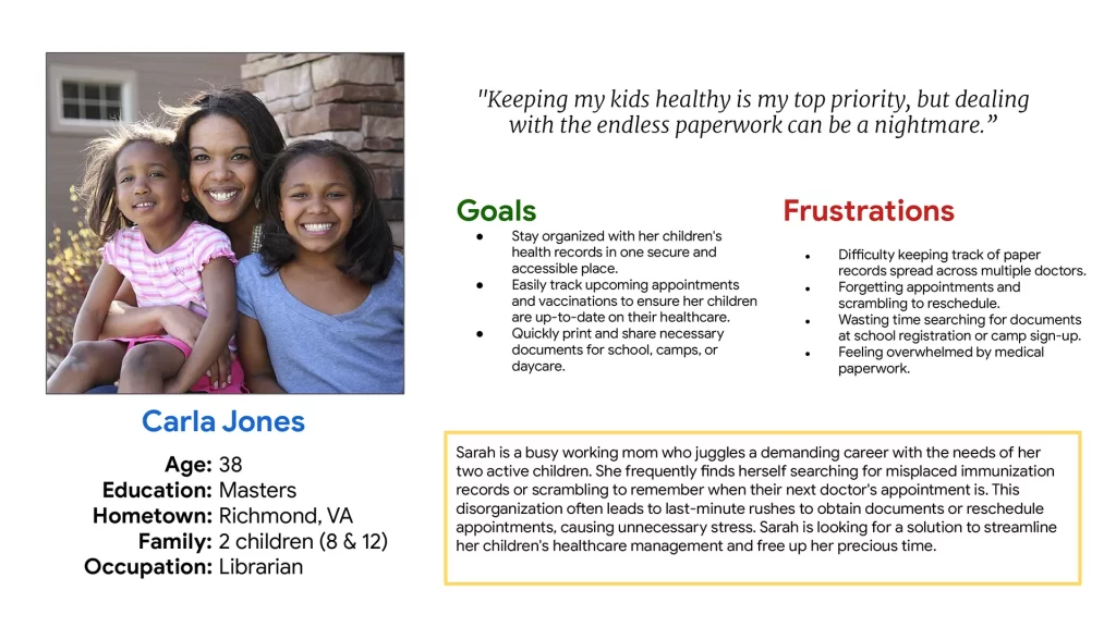
Carla is a mother of two young children who needs help staying organized with her children’s medical records because she’s feeling overwhelmed by the paperwork.
Problem statement 2:
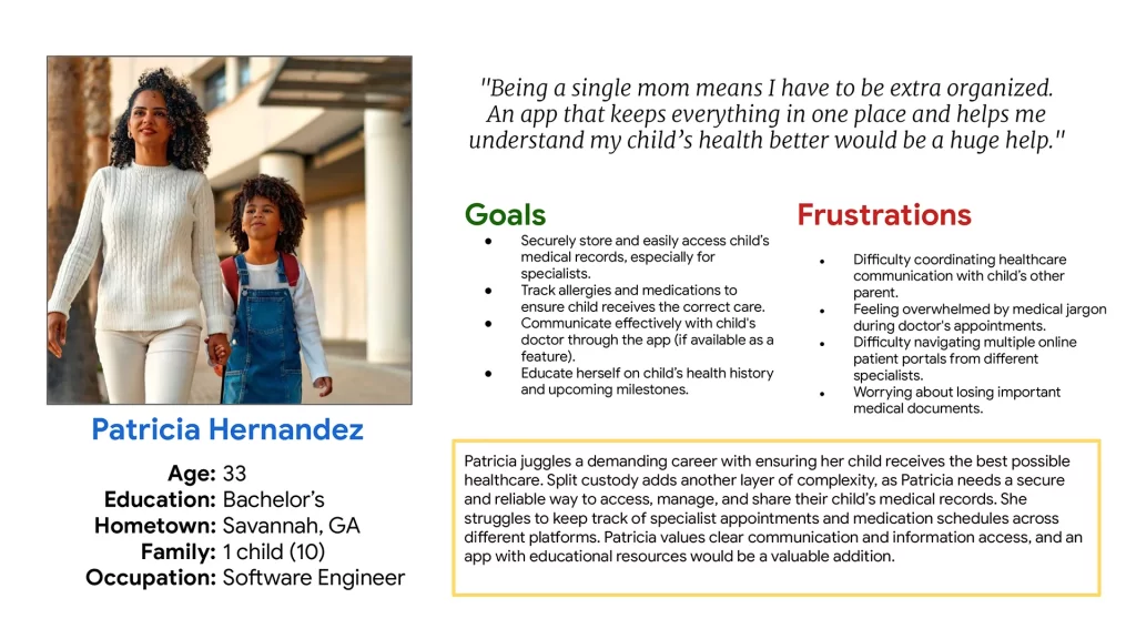
Patricia is a single mom of one who needs to securely store and share her child’s medical records because she’s worried about losing important documents or missing doctor’s appointments.
Bias Alert
One assumption I had going in was that this was work primarily done by mothers which immediately showed my bias towards hetero-normative families and roles. Even though my research subjects fit this template, I would seek out other family configurations to remove this bias in the data.

To summarize, Carefile seeks to…
“Easily store and manage your children’s medical records so you won’t have to worry about missing an important appointment or document ever again.”

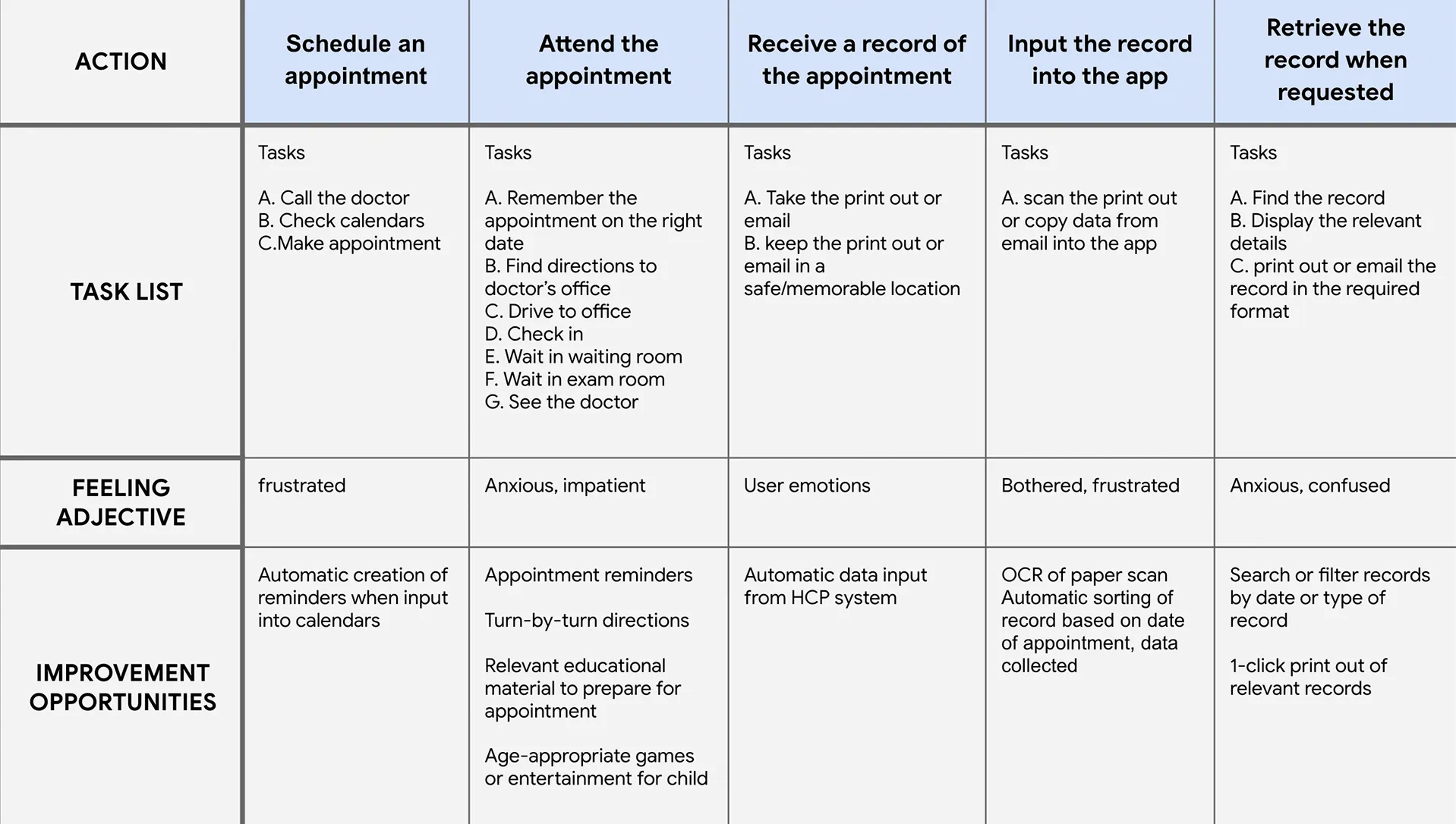
What it’s like keeping up with updating medical records after a doctor’s appointment.
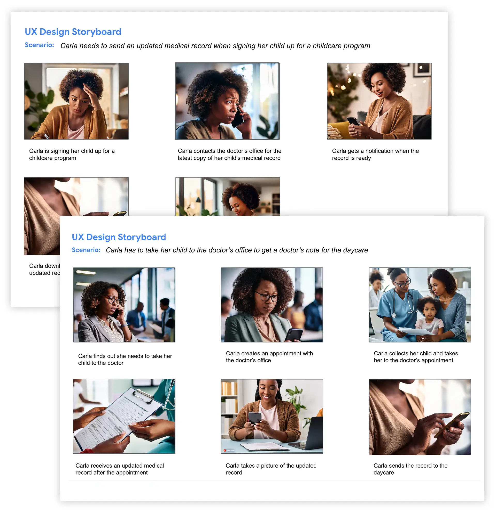
Sometimes it helps to see the struggle in full color
The two most likely times a parent would need this app is when a medical record is requested by a childcare facility or after a doctor’s visit.
2. Starting the Design
- Paper wireframes
- Digital wireframes
- Low fidelity prototypes
- Usability study
Zeroing in on the most important tasks
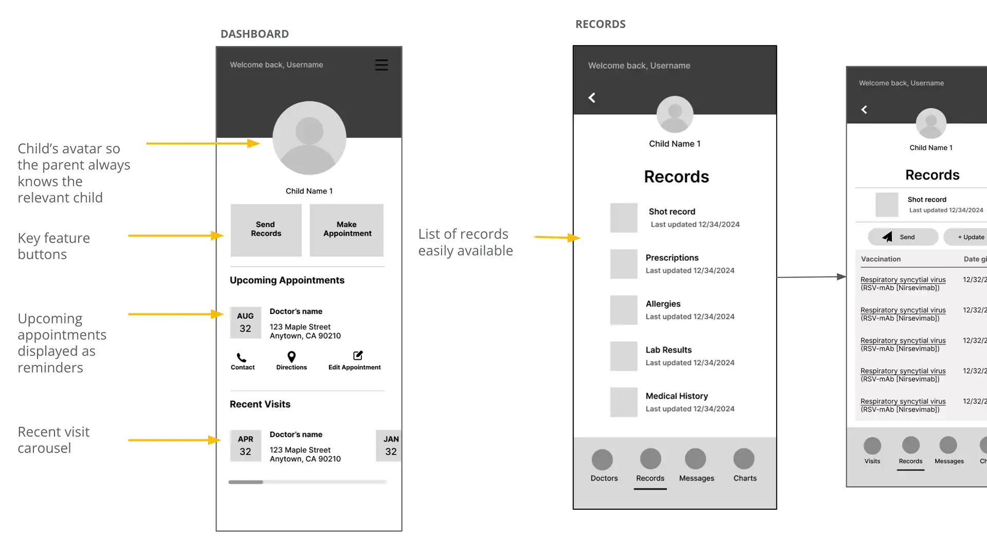
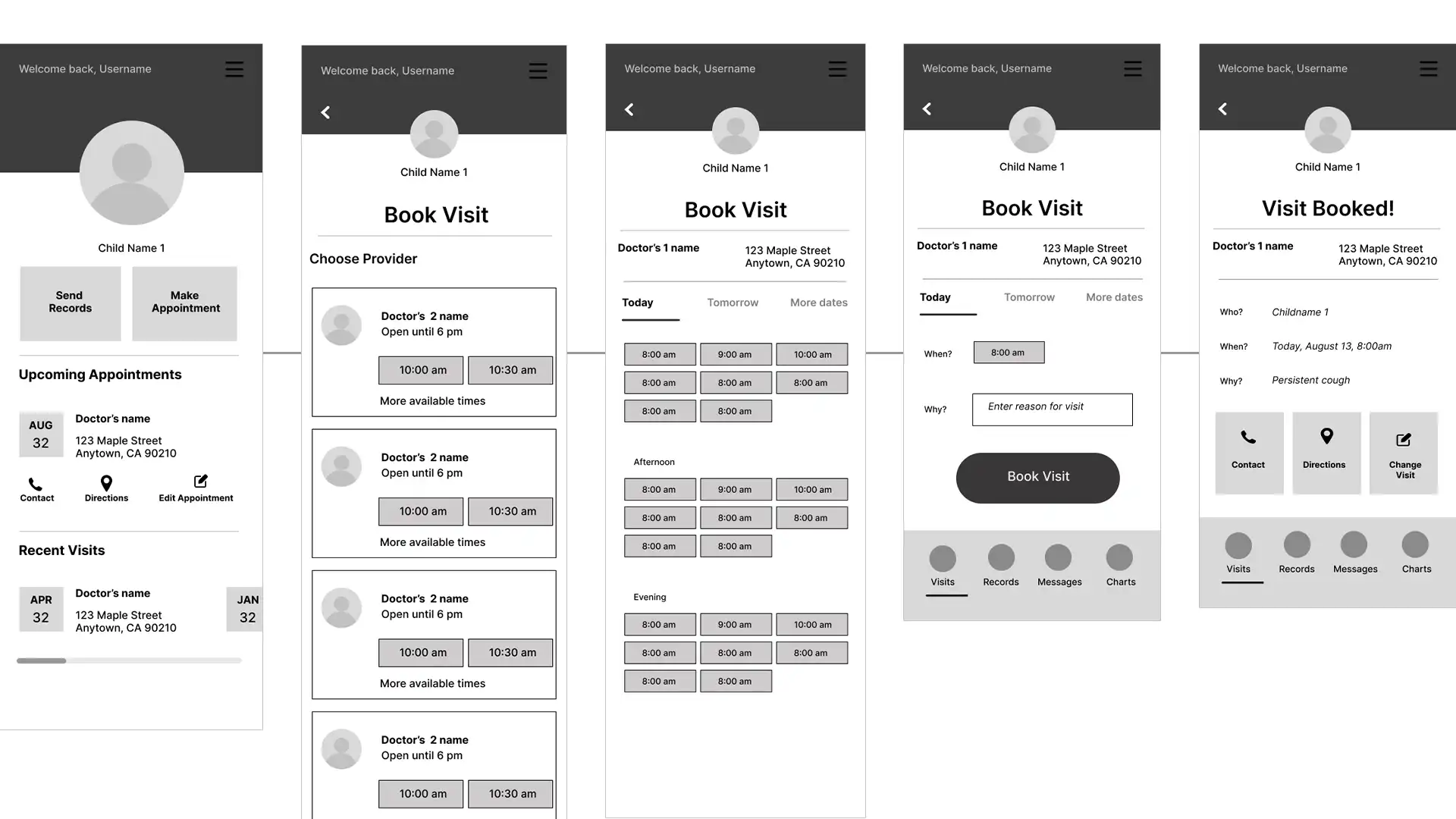
Since sending records and handling appointments were the 2 biggest tasks the app is trying to simplify, I made those buttons the centerpiece of the child dashboard.
Putting my prototypes to the test
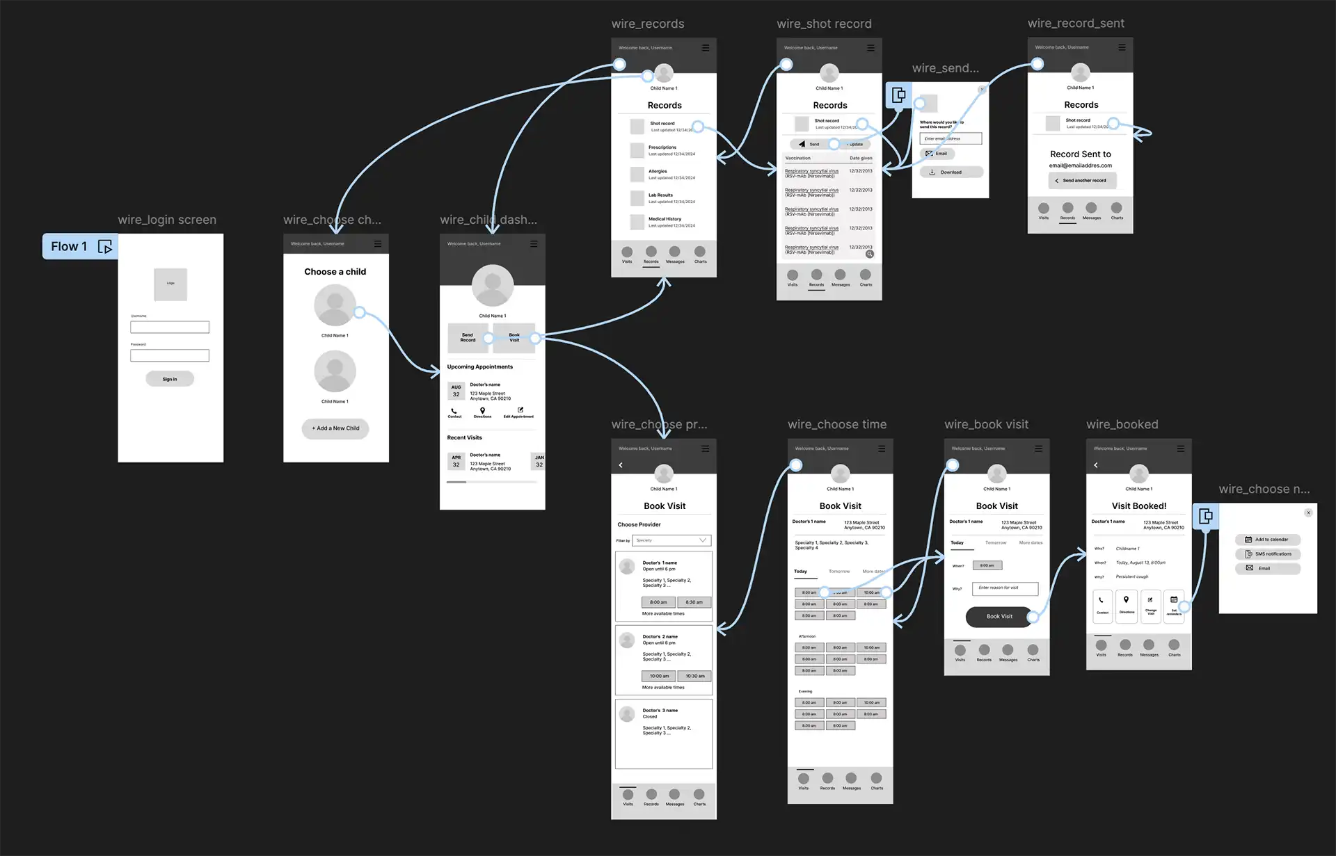
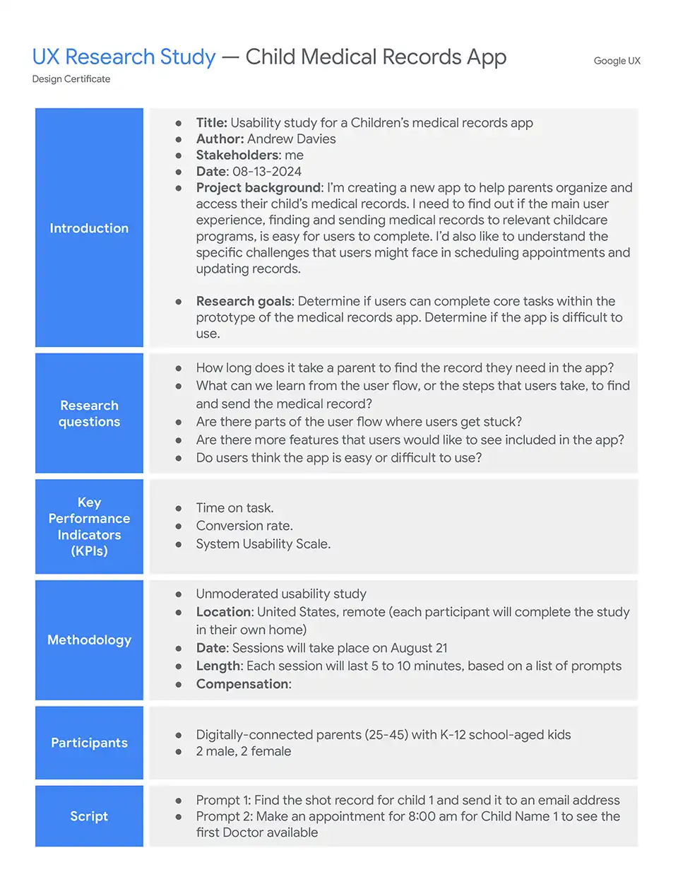
I enlisted the help of 5 parents I thought fit the target demo for this product and conducted brief moderated usability studies on my low-fidelity prototypes. The research plan was to test the process of completing two main tasks:
- Find a shot record and send them to an email address
- Book an 8:00 am appointment
FINDINGS
It was observed that 2 out of 5 participants wanted to download a medical record rather than just send it via email. This means that the app should offer a pdf option as well as email.
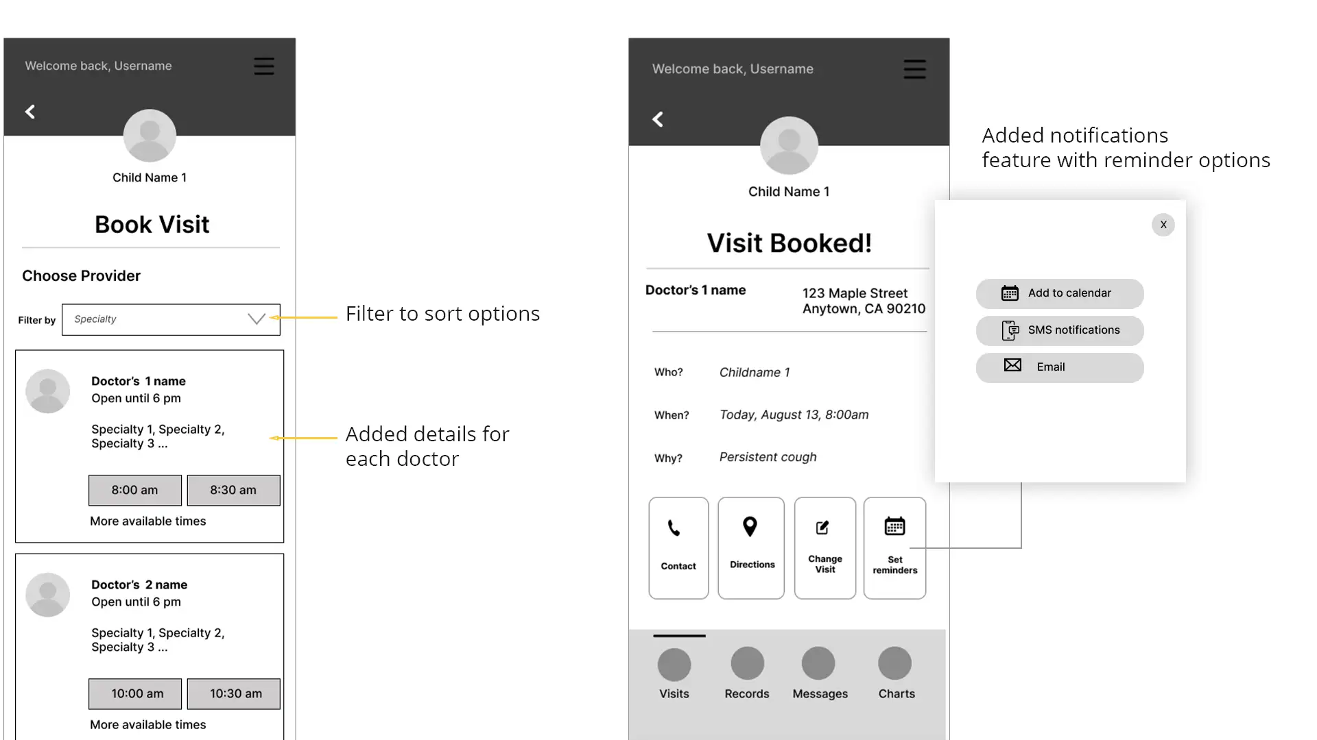
It was observed that 4 out of 5 participants wanted a variety of appointment notifications from the app. This means that (the app should provide ways to choose how the user is notified of appointment changes.
It was observed that 4 out of 5 participants wanted more ways to choose the right doctor for their visit. This means that the app should give users more information on each doctor available for a visit and a way to filter the options.
3. Refining the Design
- Mockups
- High-fidelity prototype
- Design system
- Accessibility
Design tweak 1: Offering more help to busy parents
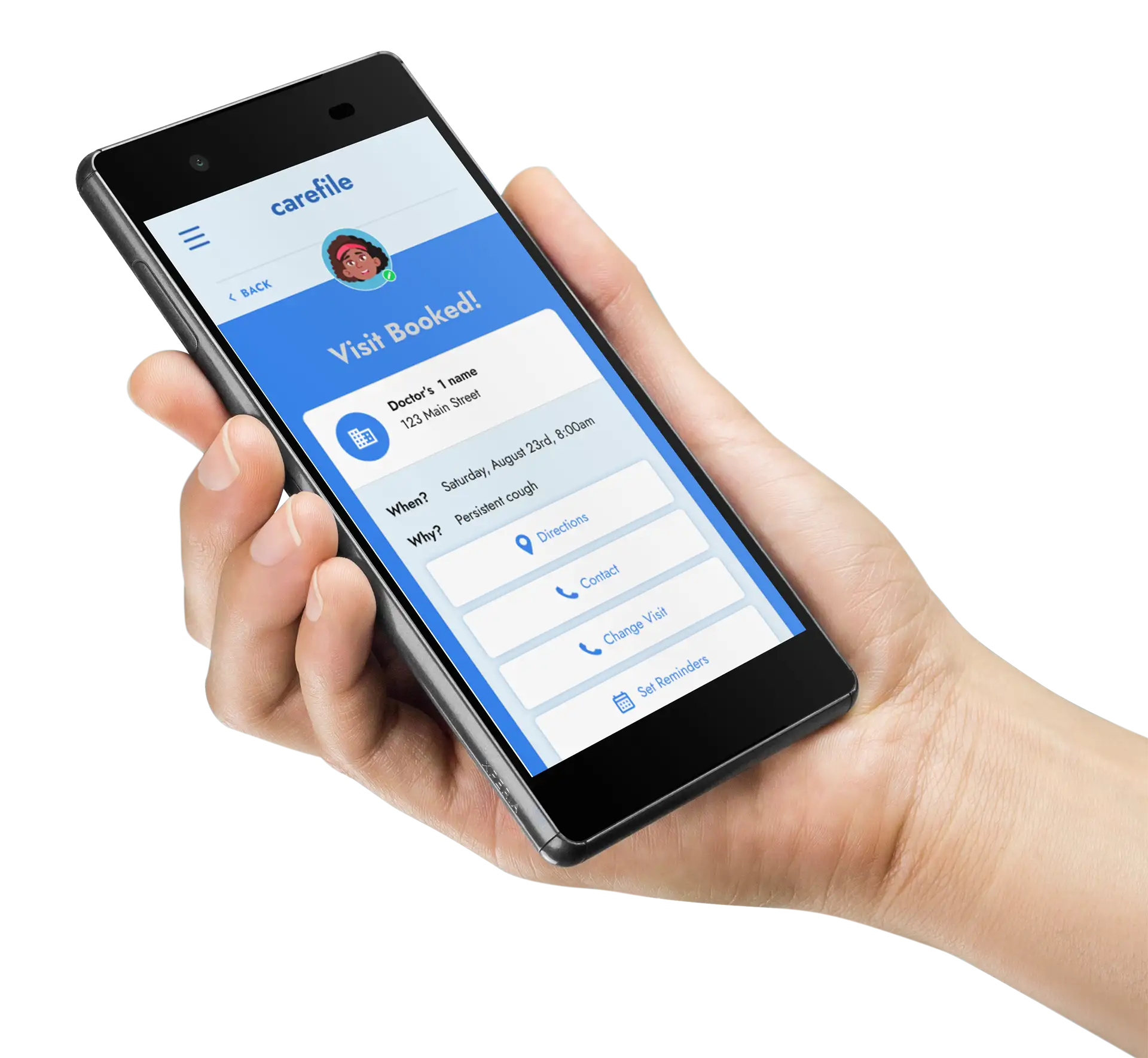
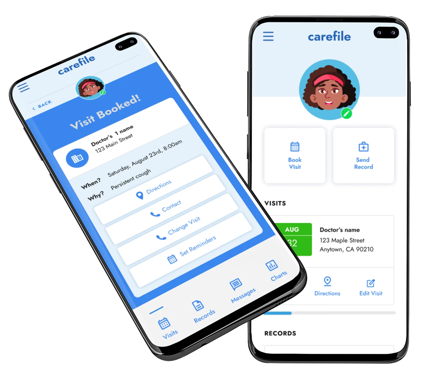
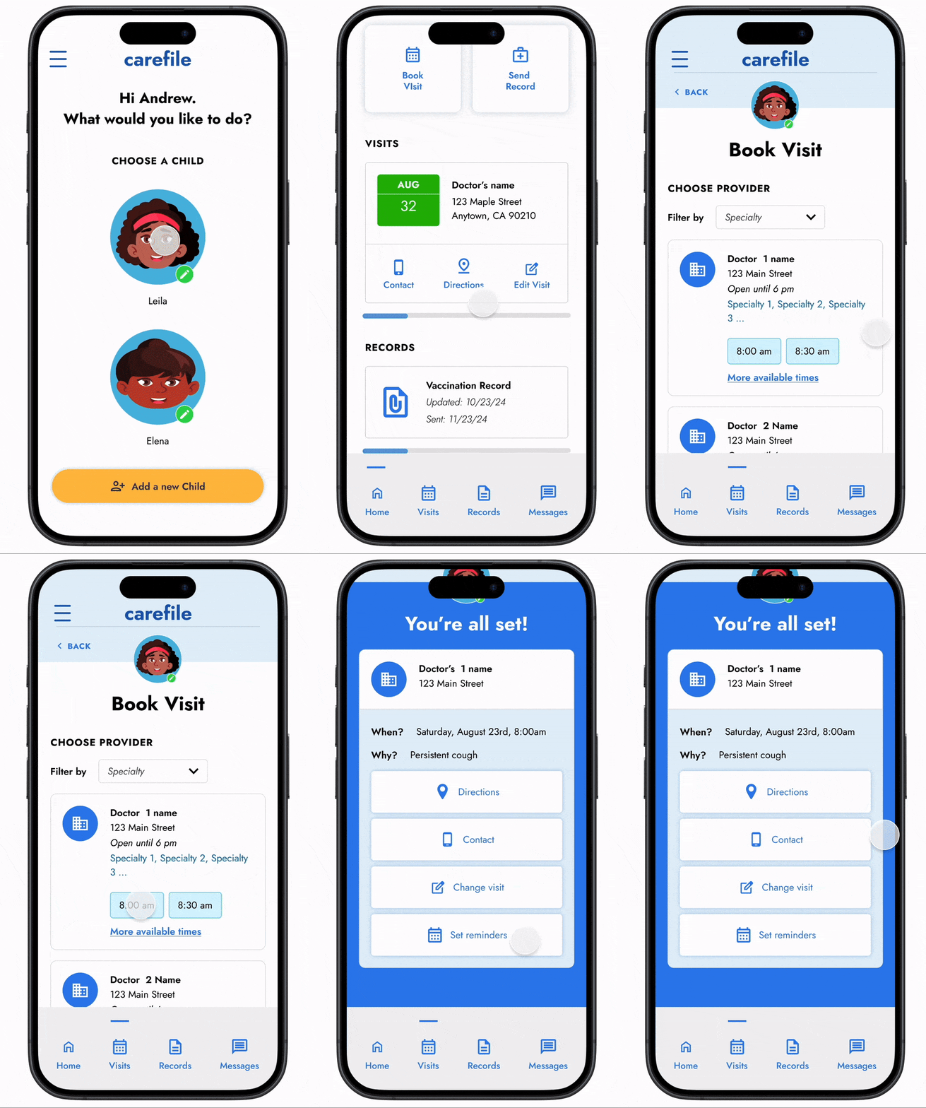
Based on user feedback I added some features like a “Set Reminders” option to the Visit Booked confirmation page. Here parents can choose from 3 ways to set an appointment notification.
Design tweak 2: Important data at a glance
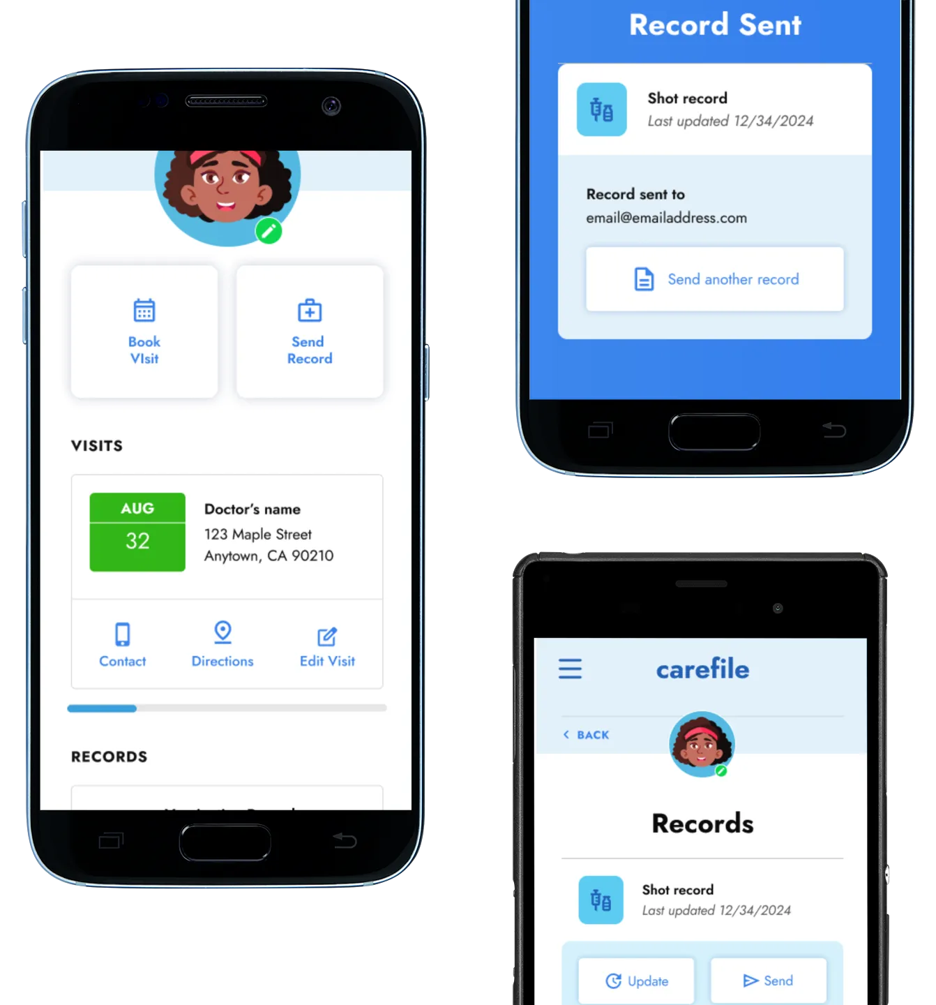
The changes continued even as I refined the mockups into high-fidelity mockups. Changes like consolidating the dashboard so that both the latest record and appointment could be immediately viewed on entry.
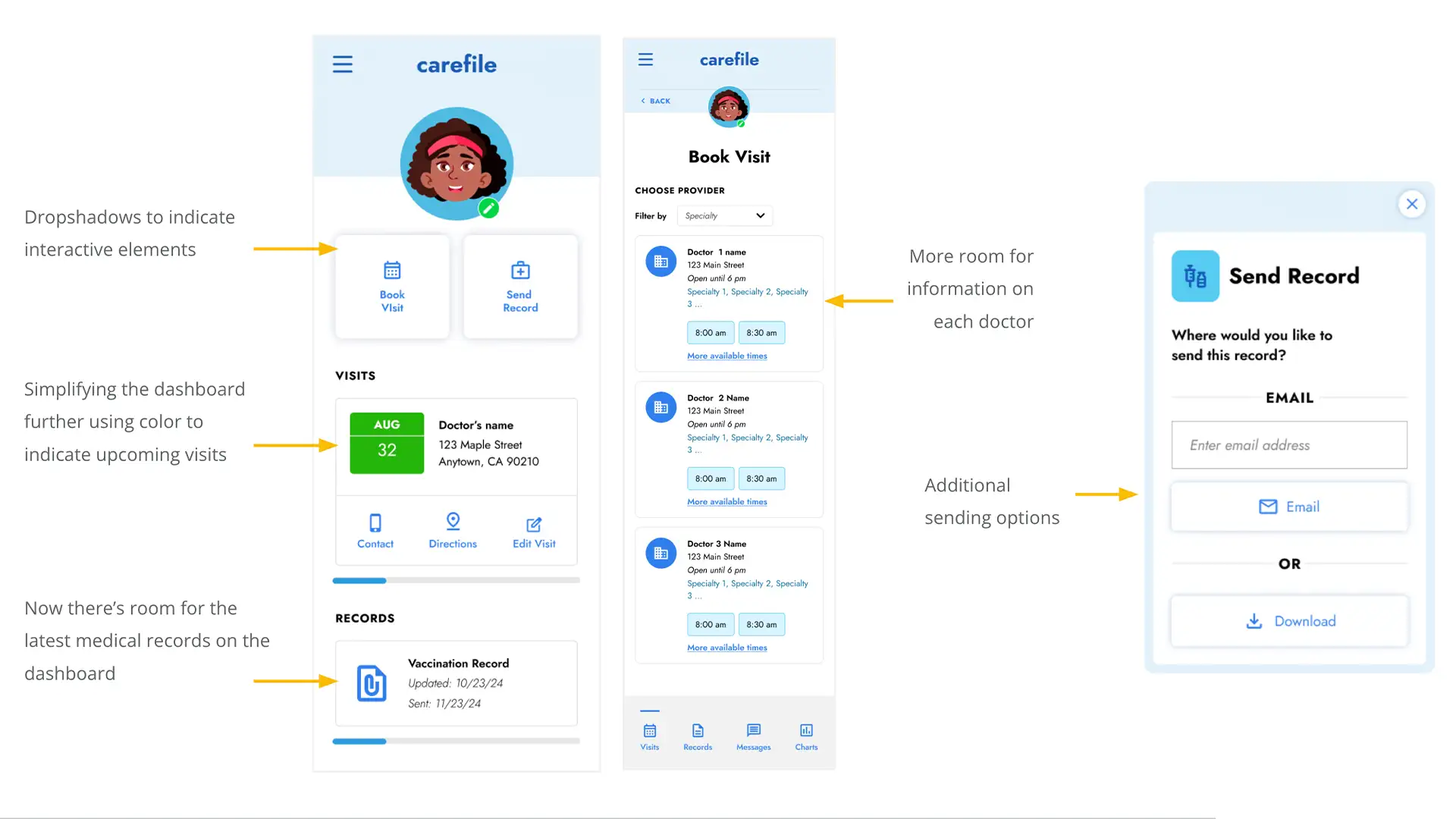
A view of the “Book a visit” process


A view of the “Send a record” process
Design tweak 3: more cowbell
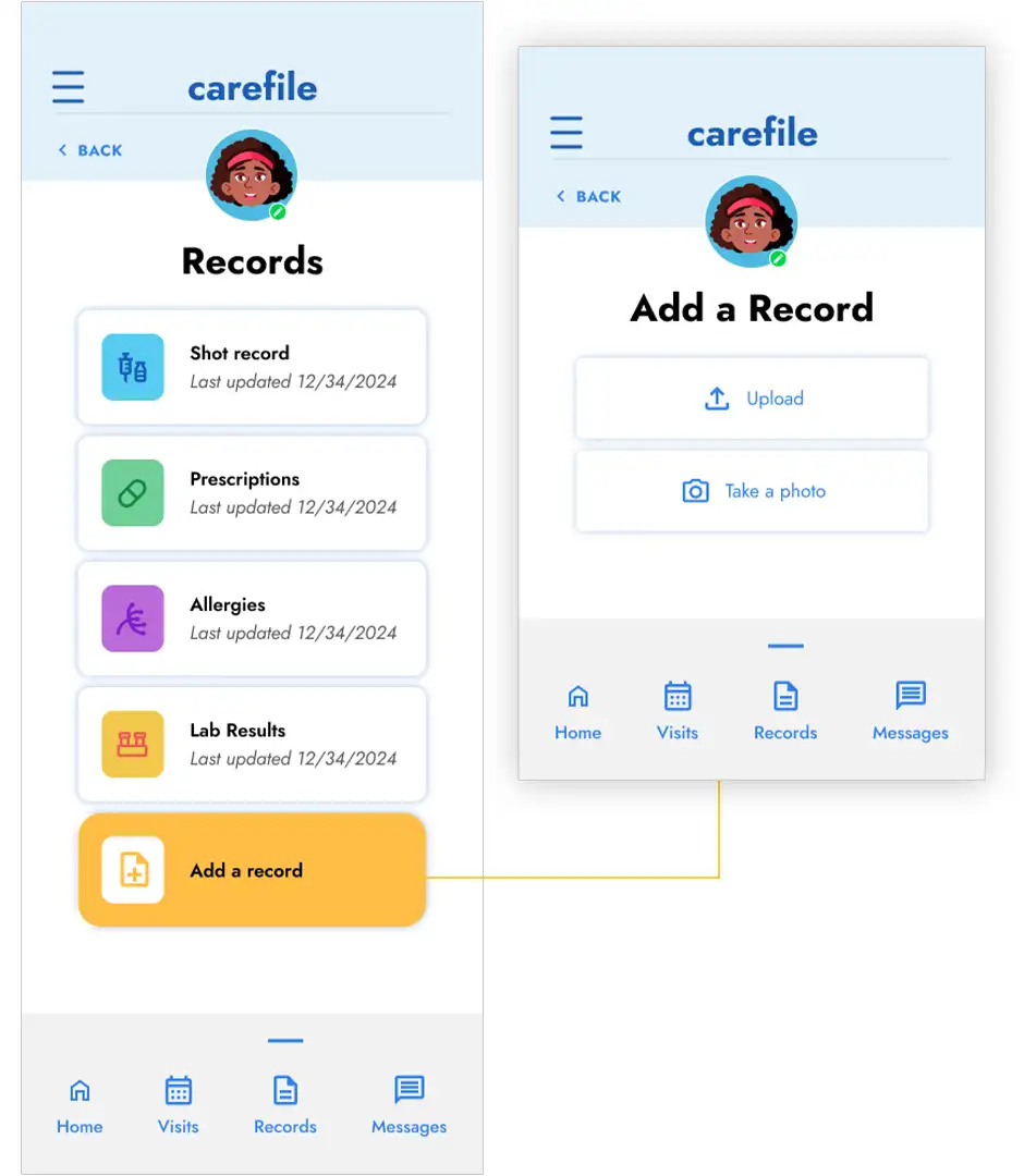
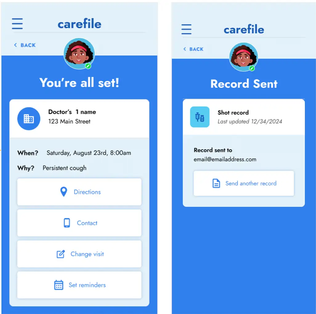
Based on another round of feedback I made a few more tweaks to the design including showing how the user would input a record, and unifying the look of the screen when a task was successfully completed.
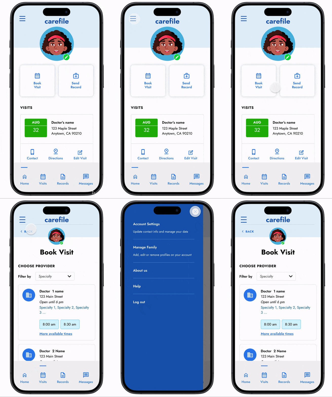
Addition of a menu slideout to reduce user frustration during usability tests
Accessibility baked in
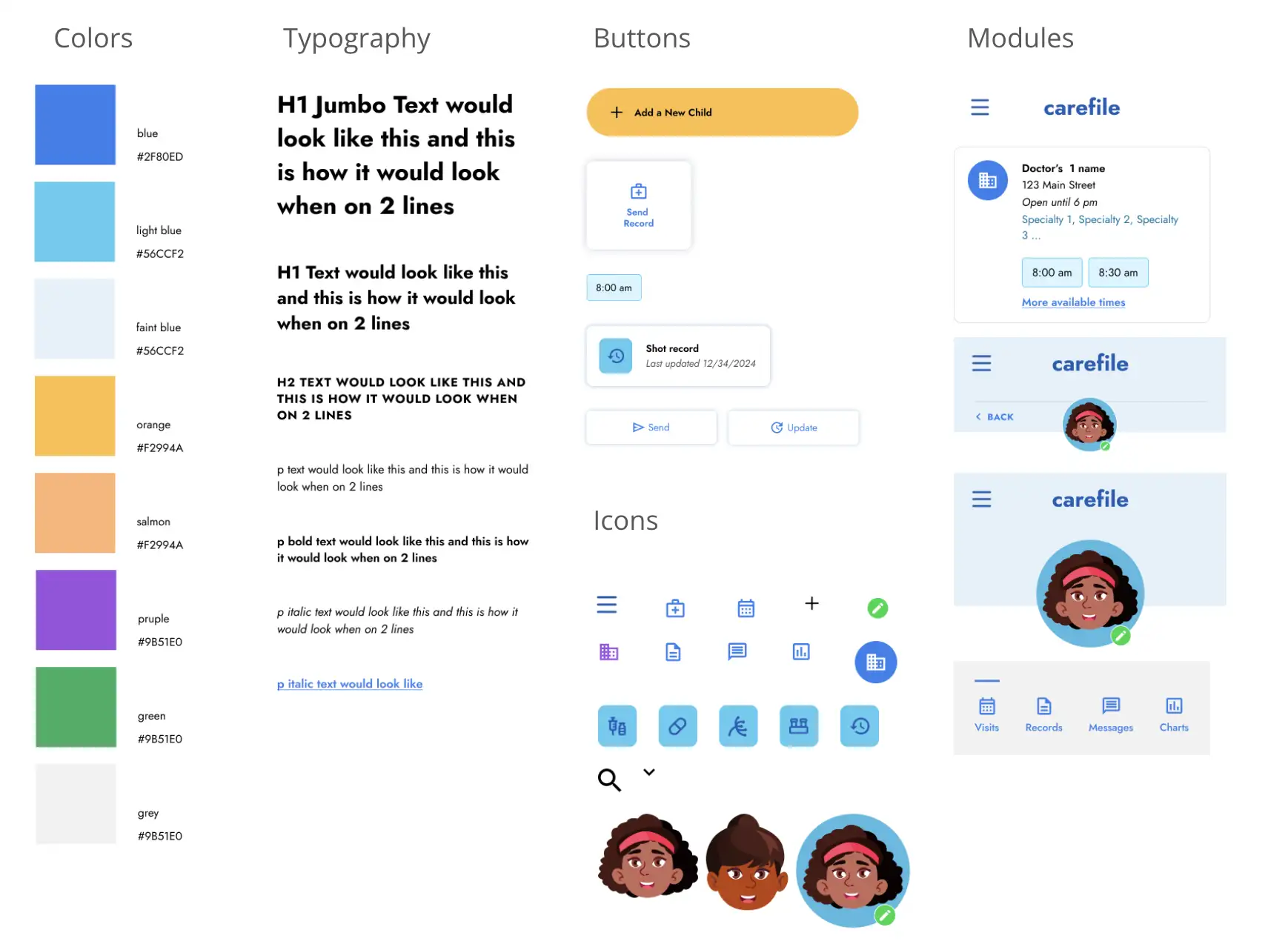
Color contrast for all text and backgrounds is at least 4.5:1
Wherever possible all key tasks have both icons and text to make navigation clear for any reading ability.
Large touch target sizes for key navigation elements liek buttons and menus
4. Going Forward
- Takeaways
- Next steps
Sometimes less is more
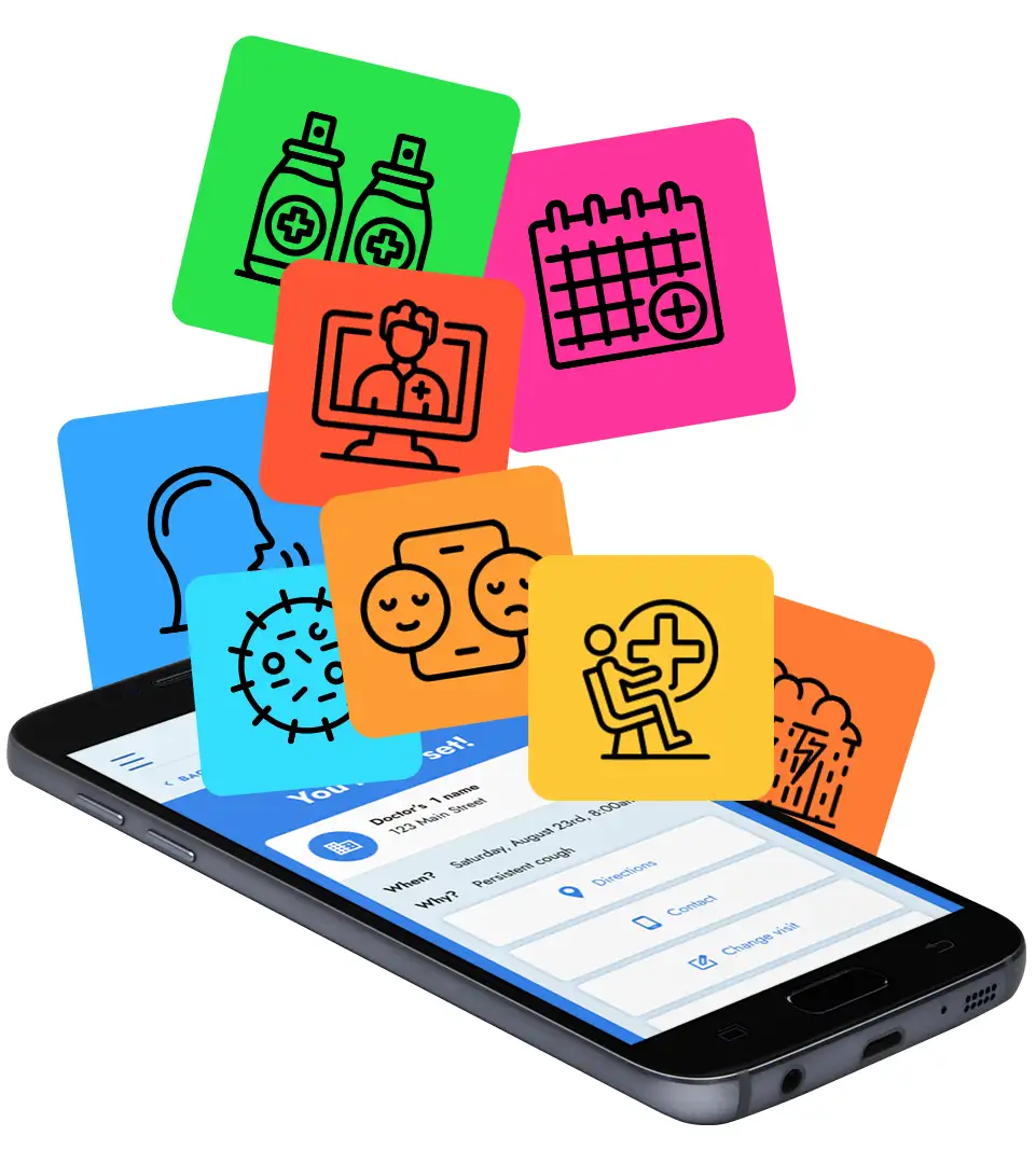
I was tempted to add more features to the app like rating doctors and being able to search the content of each medical record. But I discovered that overloading users with complex interactions can distract from the main goals of the app.
Sometimes more is more?
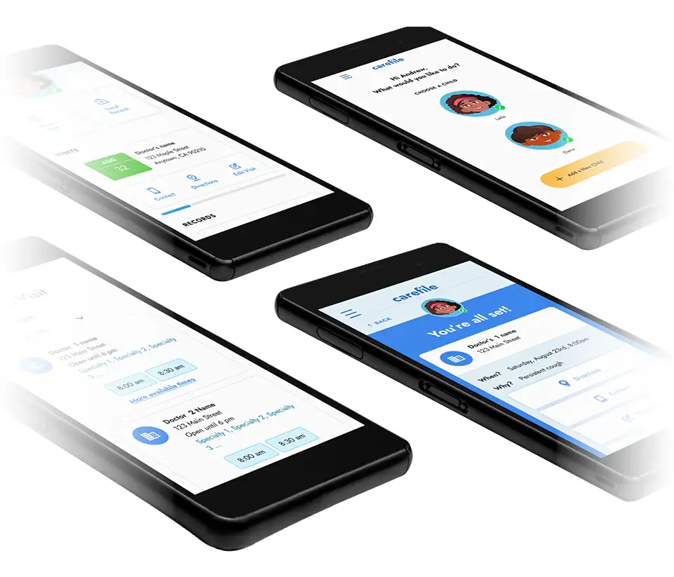
The insights from my early usability studies revealed areas where users wanted more options and information. Namely, more options for appointment notifications, more ways to collect records, and more details on doctors before booking a visit.
Next Steps
Finish up the prototype by adding screens for edge cases, simply the color scheme with fewer shades of light blue, and adding accessibility features. Once those are done, I’d like to test it out again and then pass the files on to a development team.
