Rebranding Port Tampa Bay
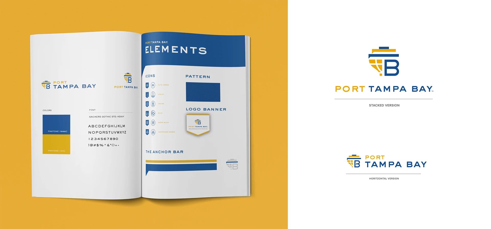
Port Tampa Bay needed to evolve its identity to represent its updated service offering and communication strategy.

Balancing Tradition and Innovation
Updating a well-known brand is always a challenge. This became even tougher because my team had to get approval from a diverse set of stakeholders, each with their own seemingly conflicting preferences.
We wanted to come up with ideas that everyone would love while still respecting the beloved original logo. The old brand was familiar but mostly reflected the industrial look of their container terminal. With their cruise business booming, they changed their name from the Tampa Port Authority to Port Tampa Bay and needed a logo that spoke to a broader, more consumer-focused audience.
Role
Art Director / Designer
Team
James Donaldson – Designer
Susan Isaacs – Creative Director
Aline Lopez- Project Manager
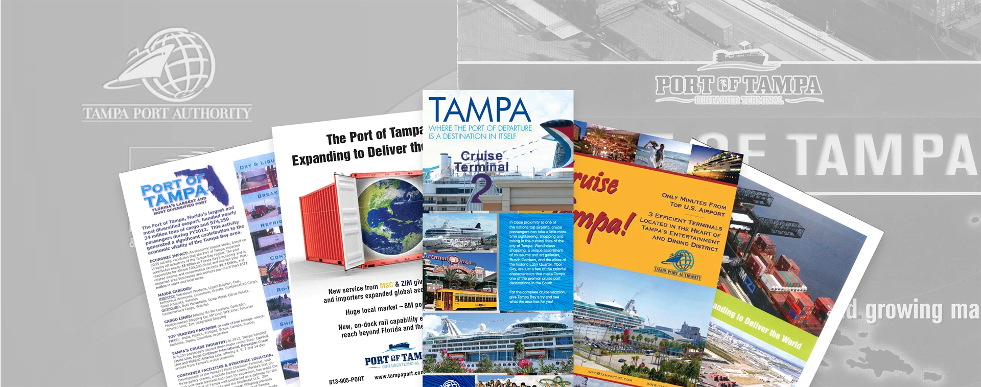
Just a smapling of how scattered their previous brand expression was.

Logos for concept 1 tapping into their cargo history

The concept for the second set of logo options centered the initials of the name Tampa Bay

The 3rd concept focused on the port as a gateway to the world.

